• Home
    • Should I trade Futures and Options? >
      • Intraday or Positional?
    • Services Offered & Pricing
    • Headlines
    • Site Map
  • Mentored training and trading
  • My Style - Blog
  • Nifty Trend
  • Data Services & Historical Data
    • Historical Data NSE
    • Historical Data MCX
    • Srini
  • Technical Analysis
    • Data Sources
    • Data Analysis Software
    • Chart Types
    • Support and Resistances
    • Chart Patterns
    • Candle Stick Patterns
    • Common Technical Indices - RSI, Stochastics, MACD, Bollinger Bands
    • Introduction to Chart Analysis
    • Build your trading strategy!
    • Trading Systems >
      • Trading Systems I : Moving Averages and Range Breakouts
      • Trading Systems II : Camarilla
      • Trading Systems III : Gann Levels - Some new thinking
      • Trading Systems IV : Murray Maths
      • Trading Systems V : Swing Trading
      • Trading Systems VI : A tango with Point and Figure charts
      • Trading Systems VII: Simulating your trades
      • Trading Systems VIII - Stop losses and targets
      • Trading Systems IX : Advanced techniques for simple and effective trading
      • Trading Systems X - Trading Without Indicators
      • Fibonnacci Levels trading
  • AFL Reference Library
  • Members Area
    • Learning
  • Contact Me
  TradeWithMe

MY STYLE - BLOG

Ranging - combining higher and lower time frame charts

10/10/2013

0 Comments

 
I had promised to show the impact of using a higher time frame chart during ranging periods. But instead of juggling between charts on different views, here is a method of showing the higher time frame chart on the time line of a lower time frame chart. The example is of 5 minute BankNifty futures shown along with a 1 minute chart of the same chart. Look at what happens on the higher time frame chart during ranging periods. Mini trends can be observed in the higher time frame that are not visible in the lower time frame. Now think of combining such charts so that you switch on and off higher time frame at will. Imagine the possibilities. Thats innovation at work at TradeWithMe. (click on any image to see a larger view).
Picture
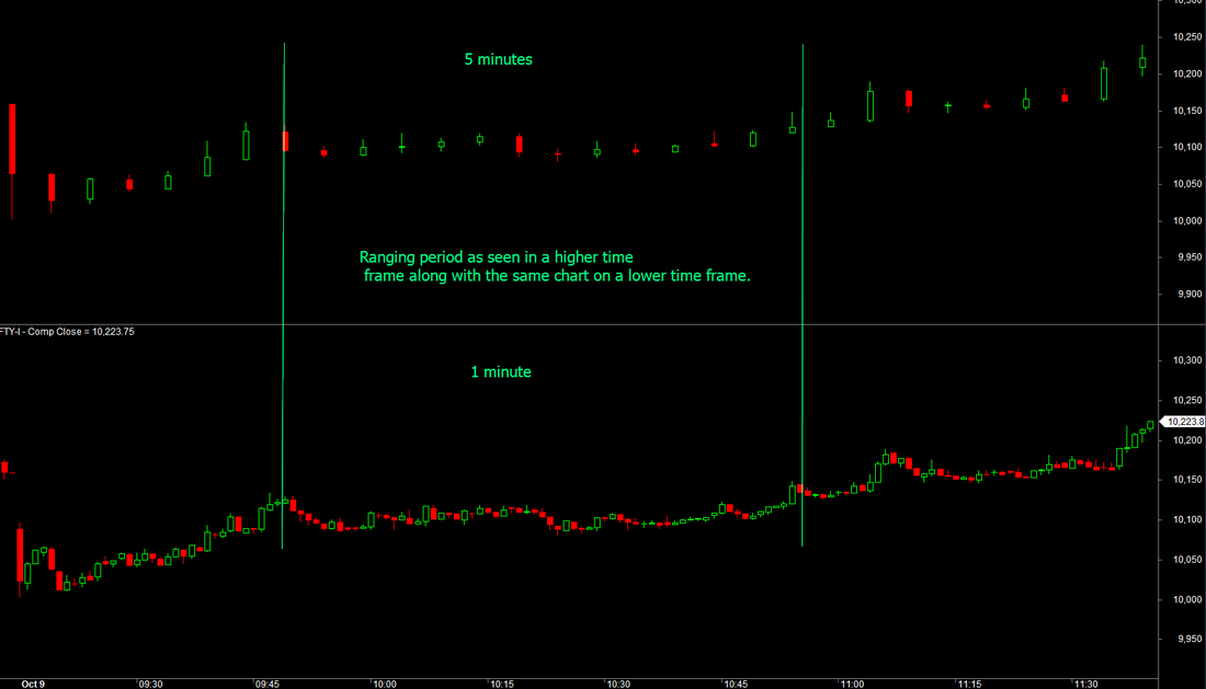
Now, if you thought that was neat, here is the combined chart...
Picture
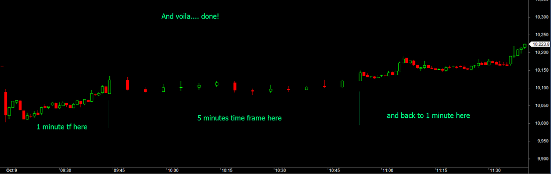
You can clearly now see a small ripple with two troughs, which then moves on to be part of the larger uptrend. This innovation may be small, but look at charts when in a trend. Its possible to stay stickily within the trend. See below the chart for October 9 2013
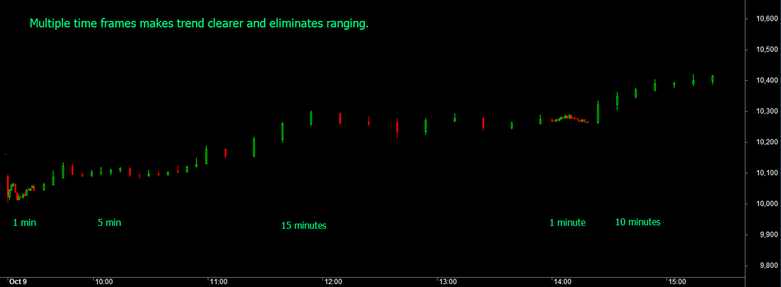
Picture
Picture
0 Comments


Leave a Reply.

    Author

    Abnash Singh, Am a Trader helping small traders to realize their dreams.

    Archives

    October 2017
    June 2017
    September 2016
    March 2016
    September 2015
    August 2015
    July 2015
    March 2015
    January 2015
    December 2014
    November 2014
    October 2014
    September 2014
    August 2014
    July 2014
    May 2014
    February 2014
    January 2014
    December 2013
    November 2013
    October 2013
    September 2013
    August 2013
    July 2013
    June 2013
    November 2012
    September 2012
    August 2012
    July 2012
    June 2012
    March 2012
    January 2012
    December 2011
    November 2011
    July 2011
    June 2011

    Categories

    All
    Customer Feedback
    Learning
    Objectives
    Risk Management
    Trading Methods

    RSS Feed

Want more information ? Get in touch with us through the contact form : (click here)