15 Trading Systems VI - A Tango with Point and Figure Charts
Did you know that all of the previously described systems can be traded efficiently using point and figure charts as well. Study the point and figure charting method and then review the following materials, where samples of trading with PnF charts using the previous systems are shown. The PnF approach usually tends to bring more objective entries and exits of trades and avoids many faulty trades because of its intrinsic approach to enter trades only on a trend.
Materials are exclusive and will not be found anywhere else on the Internet. The charts here show sample trades from real charts. This section is under construction.
Materials are exclusive and will not be found anywhere else on the Internet. The charts here show sample trades from real charts. This section is under construction.
15.1 About Point and Figure Charts
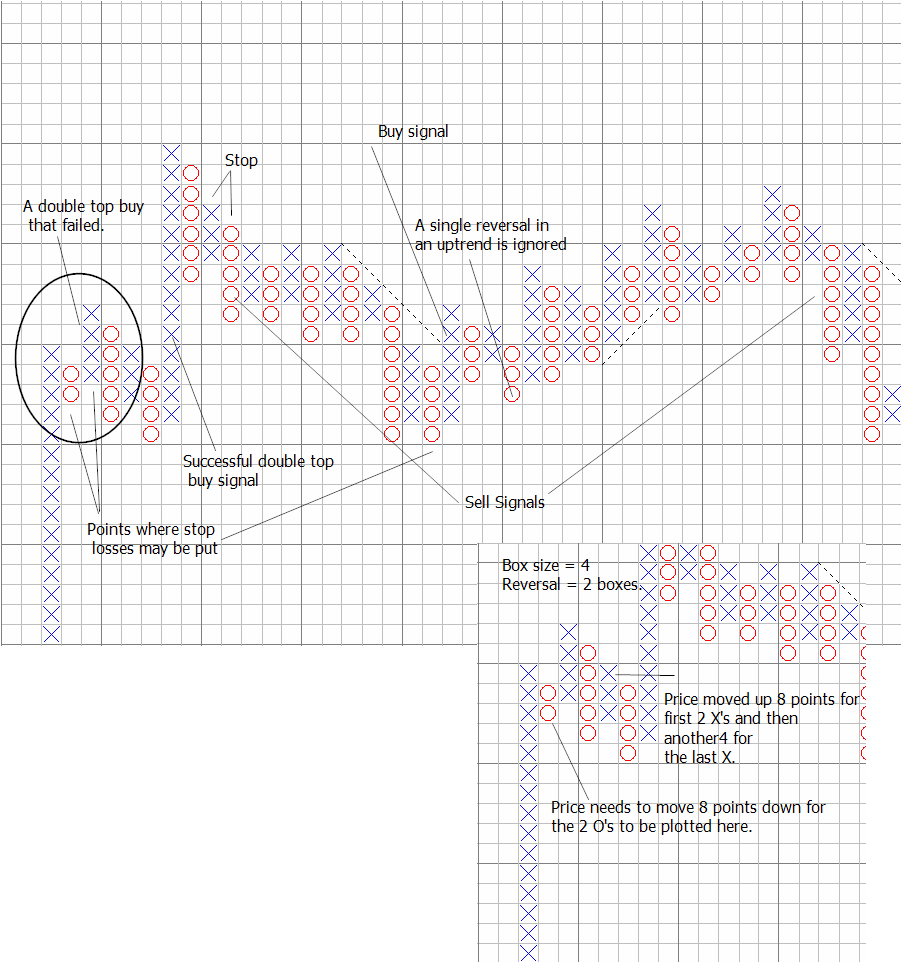
Unlike all other charting methods, point and figure charts do not have a time axis, as these are formed purely out of price action.
In its basic form, a column of X's are drawn whenever price rises above a pre-defined range, but never when its within that range and a column of O's are drawn whenever price falls, but never within that range.
Because of the asymmetric approach in the construction of the X's and O's, called the reversal, a new column is constructed only when price reverses more than 1,2,3 or more units of the predefined range, also called a box.
This last construction twist, creates a unique property in these charts, that a good amount of market noise gets cancelled and the charts give more cleaner trading signals.
The analysis platform that can be used is Bulls Eye Broker, currently v 4.0 with v 5.0 on the way.
I use it by letting it feed off data stored on my primary platform Amibroker. That has a small but acceptable limitation of needing to refresh the charts to see new price movements.
There are experts who have written AFL's to implement PnF charts on Amibroker, but these are not complete in capturing all the principles of PnF charts. Its better to use a dedicated platform, if you really want to succeed. (I have now implemented an exact representation of PnF in Amibroker with more effective usage than a standard platform because of the flexibility available).
Trading signals with PnF charts are constructed by the formation of double tops (higher highs or lower lows) and other patterns like triple tops, catapults and breakout formations. With much of the noise removed, a right selection of box size and reversal choice can help you observe the larger price movement much more clearly.
You can plot averages, RSI and other indicators on these charts as well, but the basic charts are quite effective by themselves.
In 2 box reversal and higher, the 45 degree line drawn on the charts represents a unique trend determination line. Price movement above such a line is an uptrend and below that signals a downtrend. In sideways movement, this line continues to reflect potential trend formations.
One of the most objective uses of PnF charts is their ability to forecast target levels based on the amplitude of an upthrust or downthrust or the horizontal width of a breakout.
There are TA practitioners who call PnF charts as useless mumbo jumbo, because they cant do without the time line in a chart. But those who have perfected the use of the basic PnF charts, dont talk about it and continue to make effective use of it.
The lack of the time axis is not a limitation; it helps to show real price action without the noise that time helps to create! Time labelling can be put in by writing the date at the start of a new day and at the first movement of X's and O's. (or a week, or an hour or a month or a year!). Likewise, volume is a useful addition as in all other charts. Changing box size and reversal boxes simulates charts seen in different timeframes in the conventional approach using timelines.
Read more about Point and Figure Charting in the references at the end of this section.
Pros and opportunities:
Trading becomes less noisier, as you can vary the sensitivity of the charts through a combination of box size and reversals.
With 2 box and higher reversals, the 45 degree line is a natural support or resistance line. However, its better to use risk management based SL's to optimize your profits.
Helps you to project potential targets, but not the time, as there is no time axis.
You can improve accurancy of conventional trading systems by plotting them on PnF charts. Of course the current platforms dont allow you to write scripts like Amibroker and others. Some of these are demonstrated (link given above).
Disadvantages: Not many practitioners in India.
Opportunity: Many innovations possible in your trading style.
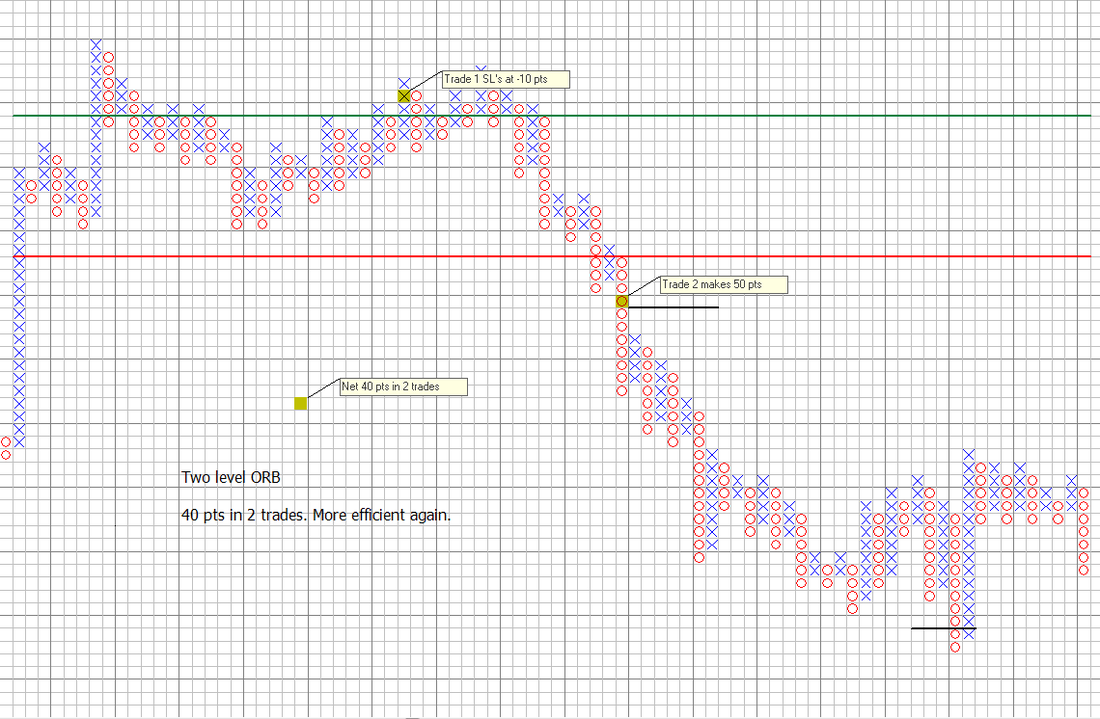
15.2 Single and Two level open range breakout charts
The inherent noise cancellation features of PnF charts avoids some false trades in the implementation of ORB trading.
See single level ORB below. (Note that the single level open range breakout, really just the market opening mean projects that the market will be bearish below the mean level and bullish above the mean level.).
See single level ORB below. (Note that the single level open range breakout, really just the market opening mean projects that the market will be bearish below the mean level and bullish above the mean level.).
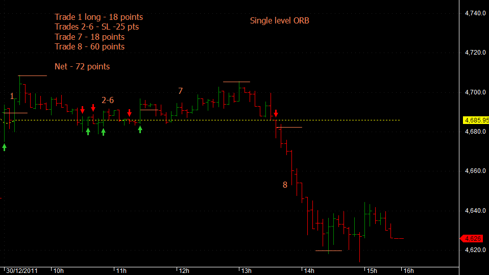
And the corresponding PnF chart showing the valid trades in the same situation
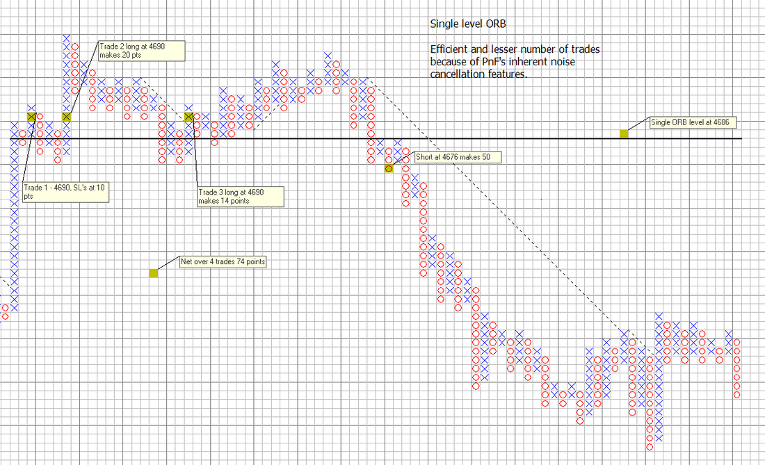
Rules for trading ORB levels on PnF charts:
Use double top and triple top entries for going long above and likewise shorting below the ORB levels.
Do not enter trades which are more than 10 points away from the Camarilla levels.
Use initial stop loss levels and a trailing stop that is kept at an appropriate distance from the high in a long trade and from a low in a short trade.
Do not use the 45 degree line as a stop loss level. You may use the 45 degree line as an exit level and for re-entry, should a trade continue after a seeming reversal.
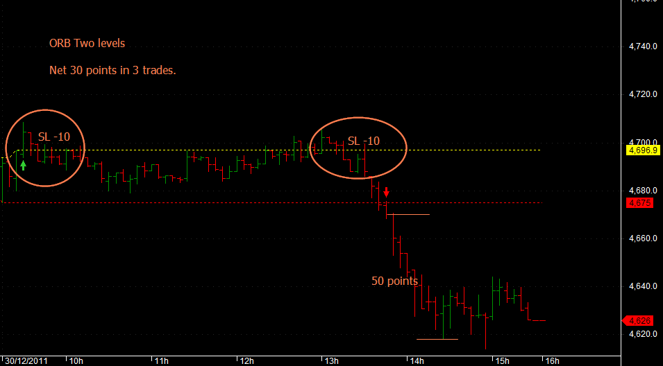
And then the 2 level ORB charts. (In 2 level range breakout, there is a true range where the noisy, sideways movements can be avoided between the highs and lows of the first 5-15 minutes of the market opening. The range can also be looked as a market mean band). Observe how clean the PnF charts are.
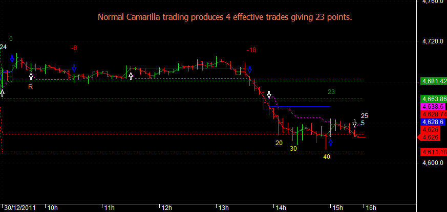
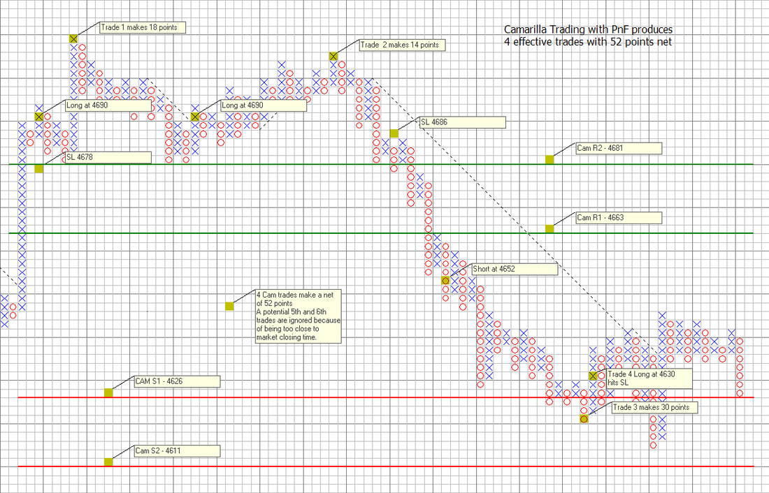
15.3 Camarilla Charts
A choppy trading day such as 30th December for the Indian Nifty futures used as a reference. Observe the trades both on conventional CAM charts and PnF. Click the PnF chart for a bigger and clearer view.
Rules for trading Camarilla levels on PnF charts:
Use double top and triple top entries for going long above S1,R1 and R2 levels and likewise shorting below R1,S1 and S2 levels.
Do not enter trades which are more than 10 points away from the Camarilla levels.
Use initial stop loss levels and a trailing stop that is kept at an appropriate distance from the high in a long trade and from a low in a short trade.
Do not use the 45 degree line as a stop loss level. You may use the 45 degree line as an exit level and for re-entry, should a trade continue after a seeming reversal.
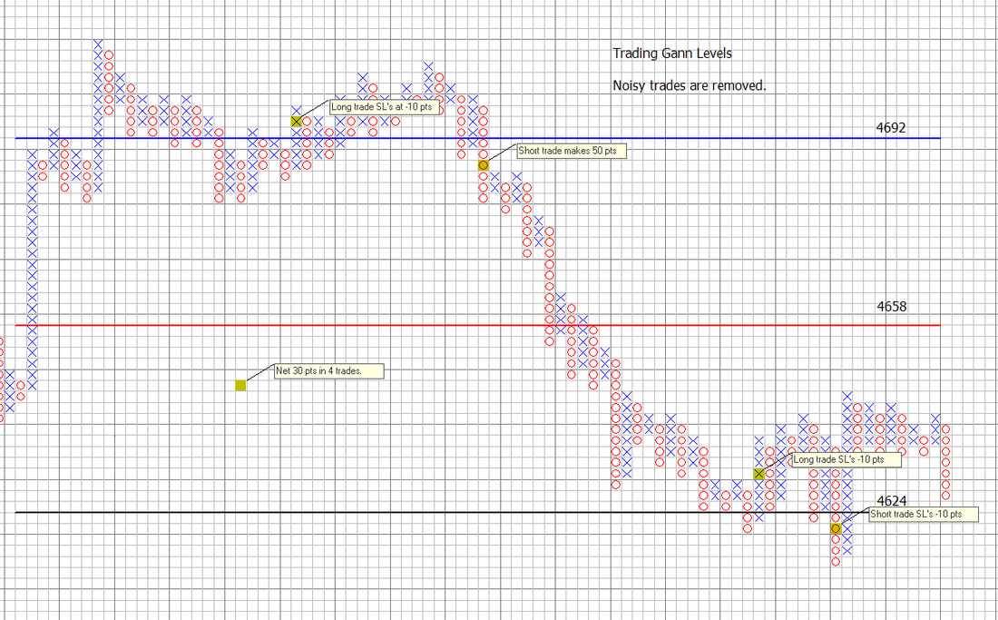
15.4 Trading Gann Levels on PnF charts
The trade entry rules are the same as for the other systems demonstrated here.
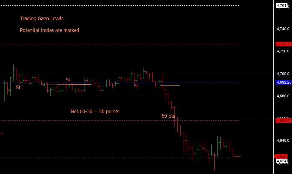
Notice how the noisy trades at the 4692 level are avoided in the PnF charts. Again PnF charts score if you ignore the trades at the 4624 level (which are not shown in the conventional charts above as well).
15.5 Showing more ways to trade with PnF charts
Apart from the traditional 45 degree resistance/support line based trades you can also trade using Moving averages or days highs and lows as shown in the charts below. You short on a double/triple bottom and go long on a double/triple top. The principles here apply to 2 box reversals and higher charts.
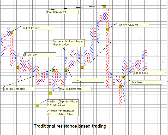
Pros of resistance based trading. Catches reversals immediately. But can be prone to noise in ranging periods.
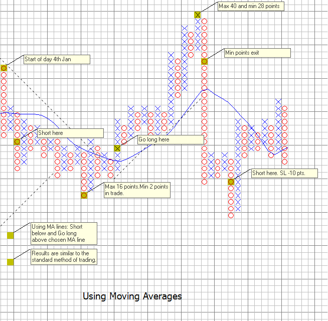
Moving averages catch trends very well, but are slow to react in ranging periods when you may get stopped out on valid signals, even while you avoid noise.
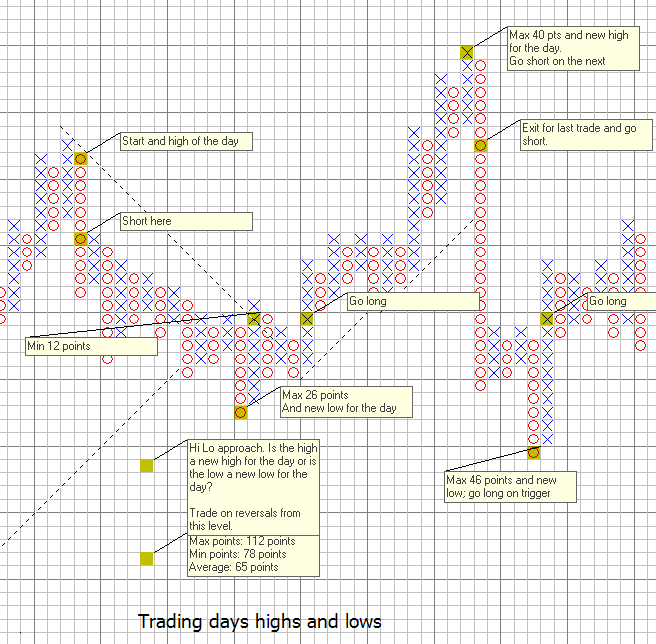
An interesting way to trade.. In long trends, you may miss a greater part of the trend when intermediate reversals occur.
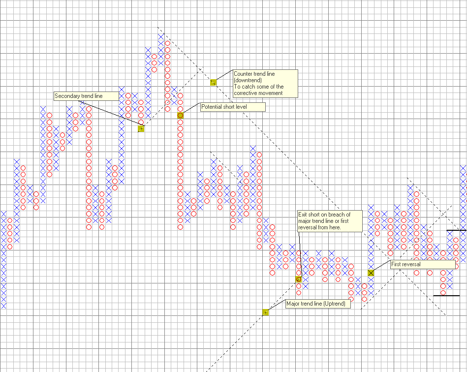
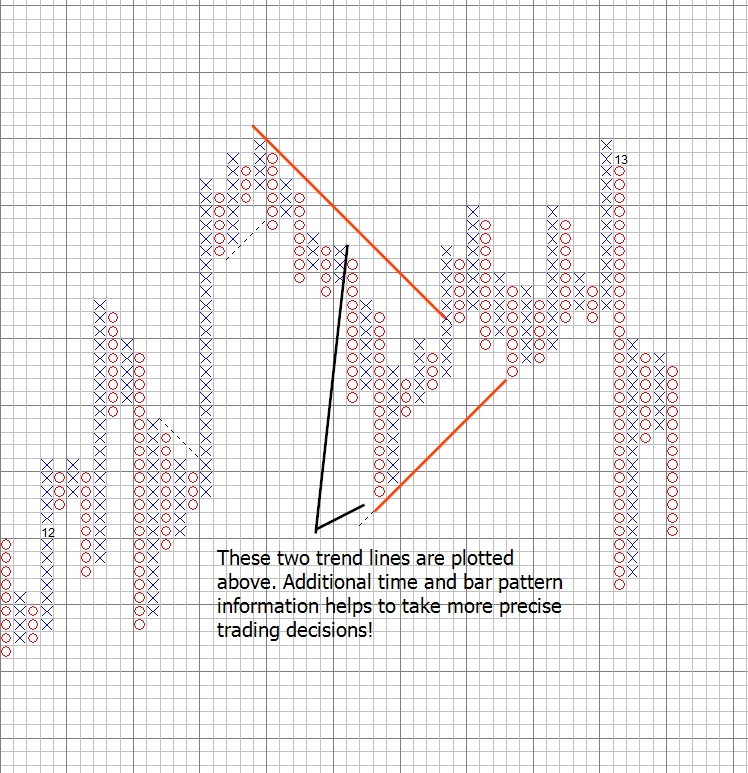
15.6 The importance of the 45 degree trend line in Point and Figure charts
By far, the forty five degree trend line in 3 box and higher box reversals, is one of the most important tools to develop clean trading rules that allow you to identify, major and minor subtrends.
To take an example the 45 degree line by definition implies price is in a strong uptrend while its above the trend line and in a down trend while its below.
In a larger trend indicated by a major 45 degree trend line, if there is a down trend, caused by an intermediate correction, this can be taken advantage of by drawing counter trend lines in the opposite direction, but with a clear understanding that being a counter-trend, price could reverse at any time, and you could reverse trade immediately, should that happen, if the counter trendline is broken.
Explore this concept a little more, and you will never trade with indicators again!
Example shown below:
A Secondary trend line drawn from the nearest low of the high helps identify an intermediate reversal, after which we get a double top sell, which is a short signal. There is an attempt to reverse, but this fails to go anywhere near the counter trend line so the short remains active till we breach the major uptrend line, from where we look for a first reversal and consider entering a long with a double tip signal. This is the most important feature of this concept, where you can avoid false reversals.
Develop your trading rules around this concept, and see a marked improvement in your trading efficiency. This concept is unique and original.
In the chart below, you will not find an intermediate reversal prior to that shown, as there is no double top sell after any such potential move.
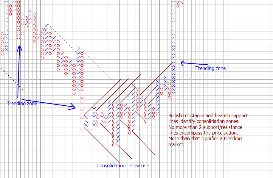
15.7 Identifying consolidation/accumalation/distribution zones made simple
One of the biggest challenges that traders have is to avoid and stay away from consolidation zones which are basically non trending. In such zones, the trading range is limited and neither buyers or sellers can make any money because of the lack of movement.
How would you identify such zones. Expert traders would look at a chart and recognize by price patterns entering a range. Technical analysts might suggest that whipsawing of a fast and slow moving average is another way to look at the beginning of consolidation.
PnF charts offer very simple and objective ways of identifying consolidation zones. One approach is to say that series of trendlines drawn as a bullish support or bearish resistance that gets violated successively.
A more cleaner way is to use the concept of bullish resistance and bearish support lines to project a channel of movement for the price and if price does not manage to cross more than 2 such lines either above or below the price action, then price is in a consolidation zone.
What are bullish resistance lines? These are lines drawn at 45 degrees from an X resting against a falling wall of O's with the next line of O's one step below. Likewise bearish support lines are drawn from edges of X's pushing up against a wall of O's. Best seen in the chart below..
The important point to note is that it does not need more than 2 such lines to encompass price in a consolidation zone. Any more than that, will signify a trend as shown. Ignore trend lines inside any double top formation for this purpose.
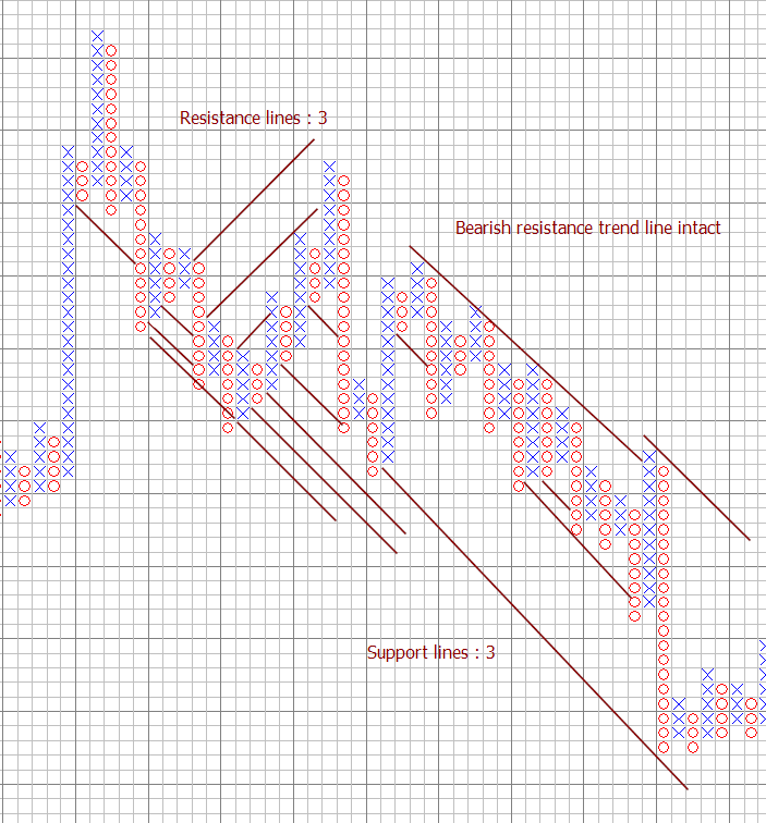
On the other hand, for trending prices, one needs to simply test whether a bullish support or a bearish resistance line remains intact in the price action zone. There drawing the bullish resistance and bearish support is an overkill as shown below. The bearish resistance line is sufficient to identify the downtrend, as would be similar bullish supports for identifying the uptrends as is the classical PnF approach. Using the method to identify consolidations is not needed to second guess trends. Its important to keep analysis simple.
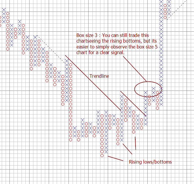
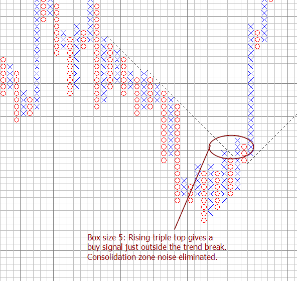
Having identified a consolidation zone, the best thing to do is to wait for a signal on a coarser PnF chart for the next signal and revert back to the finer chart. Taking the example shown above, we look at a box size of 3 in the first chart and 5 in the second case. The rising triple top is a well known strong bullish signal, while the jitter in the first chart can confuse the trader, including the sideways breakout in the final buy signal.
|
|
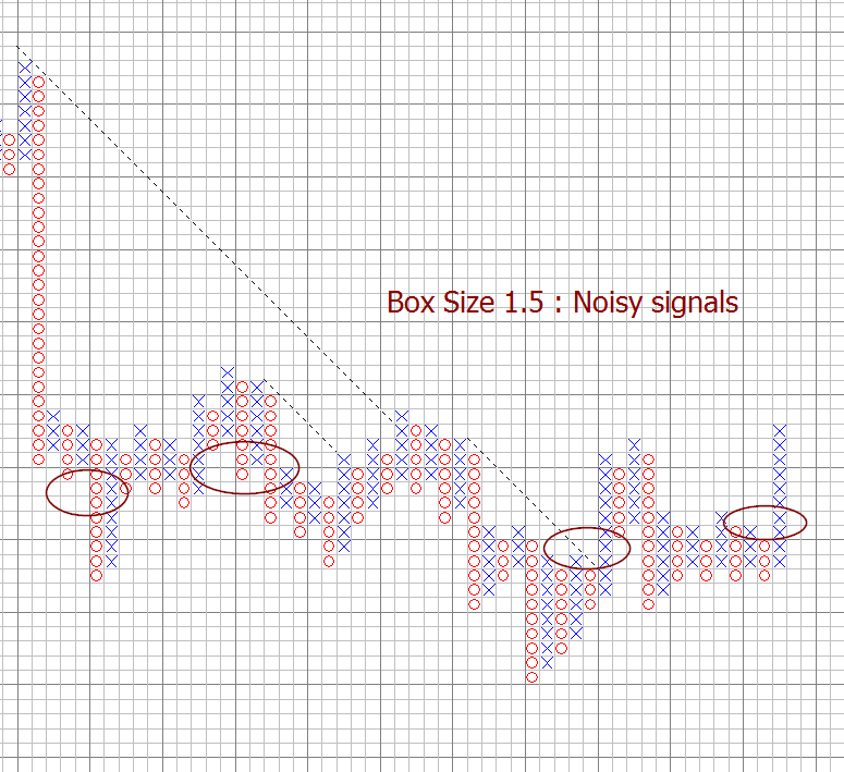
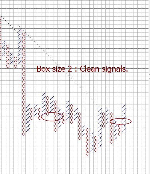
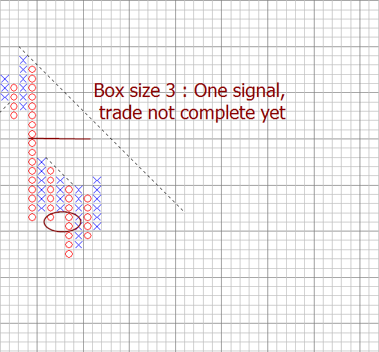
And another example of the use of different box sizes and its impact on signals:
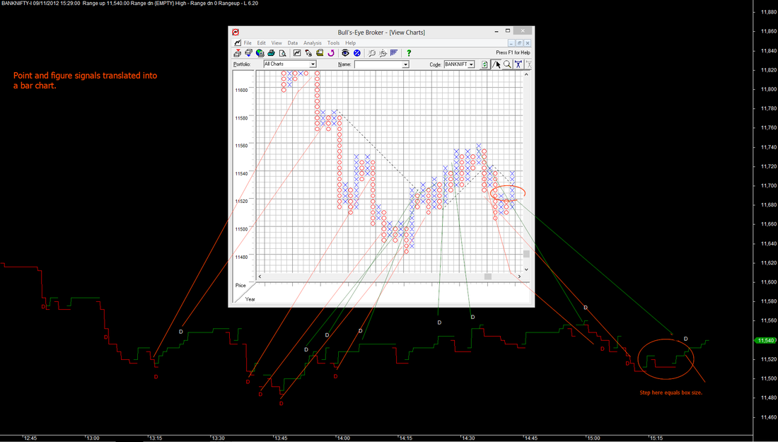
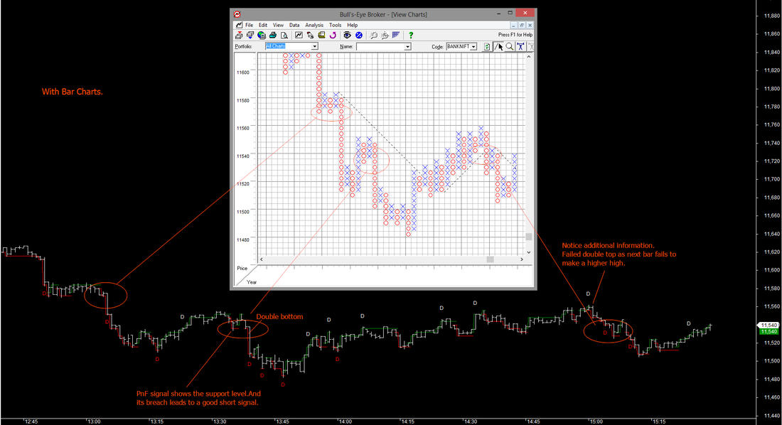
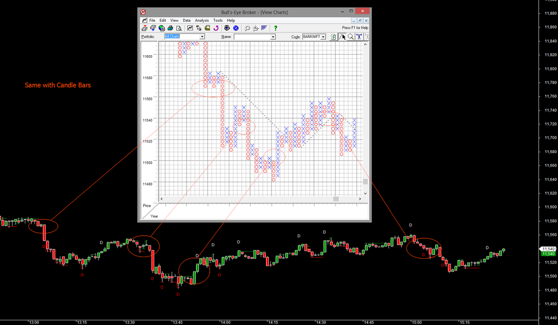
15.8 Point and Figure Signals on a time chart!
Well, have you ever thought about the possibility of seeing double bottom and top signals on a normal candle or bar chart? Combine the power of the information provided by candles and bars and use PnF signals along with them. Completely original work done in this area. See the BankNifty point and figure signals snapshot in a conventional PnF chart and translated into a normal bar chart. See the images below. The red lines represent O's and the green lines represent the X's in point and figure charts. Direction reversal is shown by an overlap of the changing trend at the last level of X's less box size or O's plus a box size. The first shows how the PnF double top and bottoms can be translated into a time chart. And the second and third shows the Bar and Candle versions of the same. Interesting isnt it? Get in touch with us for details about this, if interested. (Click the images for a larger view).
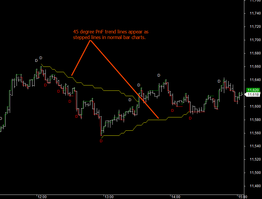
15.9 45 degree trend PnF trendlines on a time chart.
Additional work done on this subject shows some amazing results in terms of possible application of Point and Figure trendlines in normal bar charts. By coupling this with bar or candle patterns and observing the supports and resistance levels generated by PnF logic, some completely new trading insights emerge. Examples of this will be published soon. The 45 degree lines convert into stepped lines as Point and Figure charts ignore the time element completely and steps change whenever there is a trend reversal only.
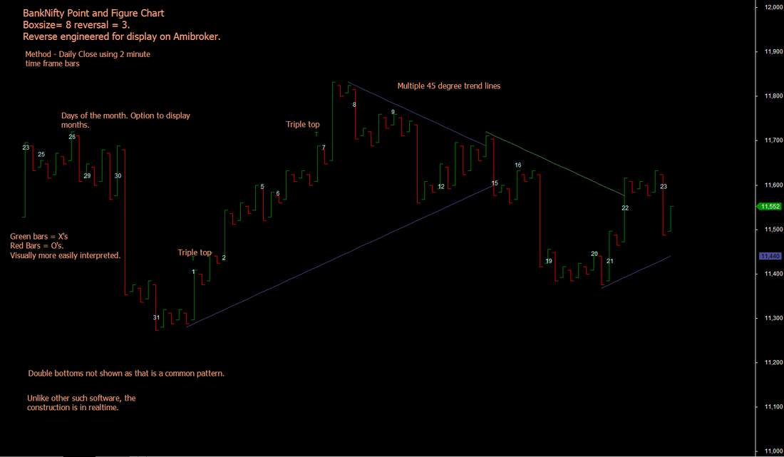
15.10 Displaying Point and Figure Charts in Amibroker
As part of our proprietary development, we have developed the point and figure method in Amibroker, and that is part of our trading tool kit. See a positional display for BankNifty below. We intend to extend this technology use to display Renko and Kagi charts too in the near future. (Both done.)
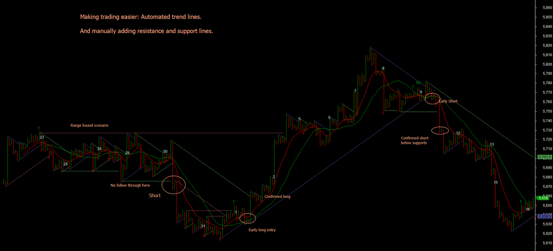
15.11 Point and Figure trades in action!
See the chart below and the logic given. This is a simple and effective way to trade. Using trend lines and resistance/supports. Click on the image for a larger view. The green bars represent X's and red bars O's. Visually, this takes away the clutter from conventional XO charts and allow greater focus on trading. There are additional secondary entry points such as the retracement from the first resistance and breakout above again. Note also how moving averages support the trade entries.
Point and Figure in action : A sample extract of trades done on 29th November and some features of our powerful trading environment. This does not show the complete trading day for the purists....
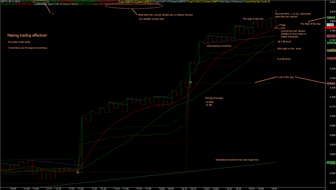
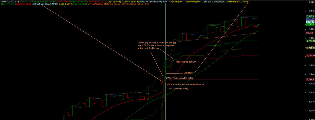
Point and Figure at work : Adding the time dimension to Point and Figure charts. This shows the time of formation of each of the X and O columns as well as where the double top or bottom levels got triggered. Essential information for a "nifty" trader!
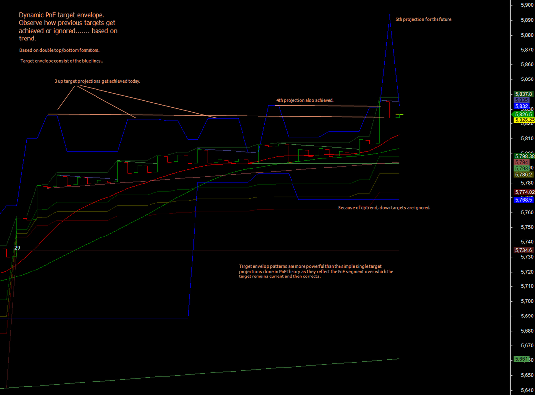
Point and Figure at work : Normally, vertical lines are drawn from a double top or bottom till the expected target. What if you let that target remain valid till the next double top/bottom and observe the changes? You will get a series of target levels whose frequency "predict" their likely achievement. In the chart below, up targets projected during the day were all achieved except the last 1, a classic fact in PnF theory.
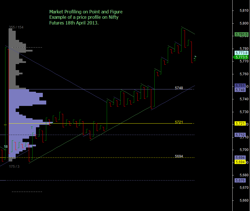
15.12 Advanced techniques with Point and Figure Charting - Market Profiling
Extending some of the advanced candles sticks analysis such as Market Profiling reveals interesting results. As PnF charts remove noise, the market profile itself gets more cleaner and sensitive to price changes. Implementing Market Profiling on PnF may be a technical challenge on most analysis platforms; however we have done this on Amibroker on our PnF engine. Look at the results below.
15.13 : Advanced Techniques used with Point and Figure Charts
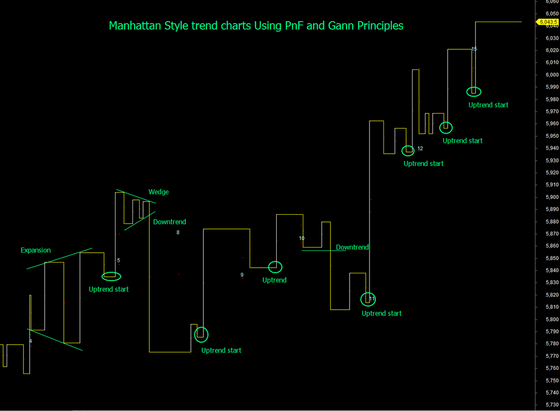
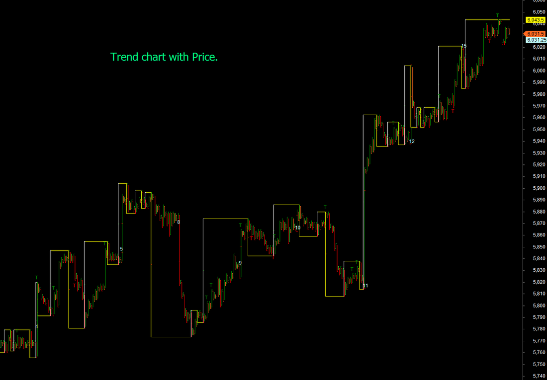
Point and Figure charts are good at reducing market noise. Gann trend lines reduce trend noise. The two together give extremely clean views of trend as shown above with potential trading zones. Methods such as these are discussed with participants of our mentored trading programs. Demonstrated above are Manhattan style trend charts drawn on an underlying PnF chart. And see below the same charts with a fixed width trend line. This shows price changes over a longer trading span and is very good to identify changes in trend and supports and resistance zones. The key is to use the right filters.. and PnF and Gann principles provide that.
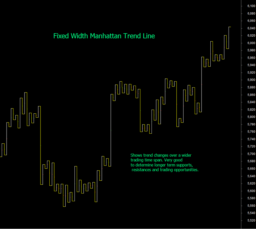
Fixed width Manhattan charts are but one step away from Kagi Chart representation. Please read section Swing Trading - section 14.13 where we have shown implementation of Kagi Charts using underlying point and figure and gann swings.
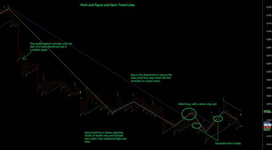
15.14 Advanced Techniques: Gann Trend and Point and Figure charts
Point and Figure charts remove noise more effectively than most other methods because of their asymmetric logic for construction. This makes them more efficient than either Renko or Kagi charts as well. Gann trend line is a trend identification technique that can be superimposed on point and figure charts to improve entry and continuation of trades. Point and figure allows the additional capability to draw the Gann trend line using simple high low logic or capture the trend of double tops and bottoms. Use of double bottoms/tops for trend line construction removes further trend noise.
15.x Learning more about Point and Figure charts
This section has demonstrated how you can implement conventional trading systems on PnF charts with potentially better results.Here is a set of reference links that will help you learn more about point and figure charts (click any of them to read more).
1 Stock Charts
2. Wikipedia
3. Investopedia
4. Tradejuice
5. Bulls Eye Broker an analysis platform.
6. E-book on PnF charts
Other recommended references:
1. The Definitive Guide to Point and Figure by Jeremy du Plesis
2. Point & Figure Charting: The Essential Application for Forecasting and Tracking Market Prices (3rd Edition) by Thomas Dorsey