7. Basic Indicators - RSI,Stochastics,MACD and Bollinger Bands
7.1 Relative Strength Index (RSI):
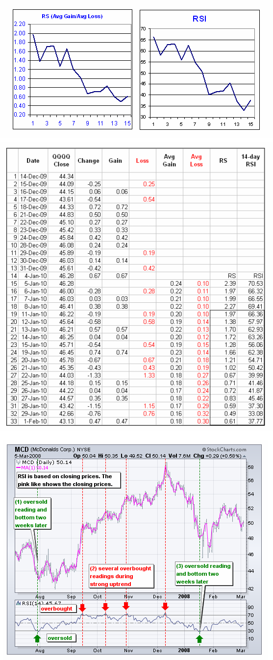
Developed J. Welles Wilder, the Relative Strength Index (RSI) is a momentum oscillator that measures the speed and change of price movements. RSI oscillates between zero and 100. Traditionally, and according to Wilder, RSI is considered overbought when above 70 and oversold when below 30. Signals can also be generated by looking for divergences, failure swings and centerline crossovers. RSI can also be used to identify the general trend.
RSI is an extremely popular momentum indicator that has been featured in a number of articles, interviews and books over the years. In particular, Constance Brown's book, Technical Analysis for the Trading Professional, features the concept of bull market and bear market ranges for RSI. Andrew Cardwell, Brown's RSI mentor, introduced positive and negative reversals for RSI. In addition, Cardwell turned the notion of divergence, literally and figuratively, on its head.
Wilder features RSI in his 1978 book, New Concepts in Technical Trading Systems. This book also includes the Parabolic SAR, Average True Range and the Directional Movement Concept (ADX). Despite being developed before the computer age, Wilder's indicators have stood the test of time and remain extremely popular.
Read the full article at : stockcharts.com
7.1.1 RSI Calculation
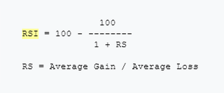
To simplify the calculation explanation, RSI has been broken down into its basic components: RS, Average Gain and Average Loss. This RSI calculation is based on 14 periods, which is the default suggested by Wilder in his book. Losses are expressed as positive values, not negative values.
The very first calculations for average gain and average loss are simple 14 period averages.
Wilder's formula normalizes RS and turns it into an oscillator that fluctuates between zero and 100. In fact, a plot of RS looks exactly the same as a plot of RSI. The normalization step makes it easier to identify extremes because RSI is range bound. RSI is 0 when the Average Gain equals zero. Assuming a 14-period RSI, a zero RSI value means prices moved lower all 14 periods. There were no gains to measure. RSI is 100 when the Average Loss equals zero. This means prices moved higher all 14 periods. There were no losses to measure.Here's an Excel Spreadsheet that shows the start of an RSI calculation in action.
Note: The smoothing process affects RSI values. RS values are smoothed after the first calculation. Average Loss equals the sum of the losses divided by 14 for the first calculation. Subsequent calculations multiply the prior value by 13, add the most recent value and then divide the total by 14. This creates a smoothing affect. The same applies to Average Gain. Because of this smoothing, RSI values may differ based on the total calculation period. 250 periods will allow for more smoothing than 30 periods and this will slightly affect RSI values. Stockcharts.com goes back 250-days when possible. If Average Loss equals zero, a "divide by zero" situation occurs for RS and RSI is set to 100 by definition. Similarly, RSI equals 0 when Average Gain equals zero.
The default look-back period for RSI is 14, but this can be lowered to increase sensitivity or raised to decrease sensitivity. 10-day RSI is more likely to reach overbought or oversold levels than 20-day RSI. The look-back parameters also depend on a security's volatility. 14-day RSI for internet retailer Amazon (AMZN) is more likely to become overbought or oversold than 14-day RSI for Duke Energy (DUK), a utility.
RSI is considered overbought when above 70 and oversold when below 30. These traditional levels can also be adjusted to better fit the security or analytical requirements. Raising overbought to 80 or lowering oversold to 20 will reduce the number of overbought/oversold readings. Short-term traders sometimes use 2-period RSI to look for overbought readings above 80 and oversold readings below 20.
Read the full article at : stockcharts.com
The very first calculations for average gain and average loss are simple 14 period averages.
- First Average Gain = Sum of Gains over the past 14 periods / 14.
- First Average Loss = Sum of Losses over the past 14 periods / 14
- Average Gain = [(previous Average Gain) x 13 + current Gain] / 14.
- Average Loss = [(previous Average Loss) x 13 + current Loss] / 14.
Wilder's formula normalizes RS and turns it into an oscillator that fluctuates between zero and 100. In fact, a plot of RS looks exactly the same as a plot of RSI. The normalization step makes it easier to identify extremes because RSI is range bound. RSI is 0 when the Average Gain equals zero. Assuming a 14-period RSI, a zero RSI value means prices moved lower all 14 periods. There were no gains to measure. RSI is 100 when the Average Loss equals zero. This means prices moved higher all 14 periods. There were no losses to measure.Here's an Excel Spreadsheet that shows the start of an RSI calculation in action.
Note: The smoothing process affects RSI values. RS values are smoothed after the first calculation. Average Loss equals the sum of the losses divided by 14 for the first calculation. Subsequent calculations multiply the prior value by 13, add the most recent value and then divide the total by 14. This creates a smoothing affect. The same applies to Average Gain. Because of this smoothing, RSI values may differ based on the total calculation period. 250 periods will allow for more smoothing than 30 periods and this will slightly affect RSI values. Stockcharts.com goes back 250-days when possible. If Average Loss equals zero, a "divide by zero" situation occurs for RS and RSI is set to 100 by definition. Similarly, RSI equals 0 when Average Gain equals zero.
The default look-back period for RSI is 14, but this can be lowered to increase sensitivity or raised to decrease sensitivity. 10-day RSI is more likely to reach overbought or oversold levels than 20-day RSI. The look-back parameters also depend on a security's volatility. 14-day RSI for internet retailer Amazon (AMZN) is more likely to become overbought or oversold than 14-day RSI for Duke Energy (DUK), a utility.
RSI is considered overbought when above 70 and oversold when below 30. These traditional levels can also be adjusted to better fit the security or analytical requirements. Raising overbought to 80 or lowering oversold to 20 will reduce the number of overbought/oversold readings. Short-term traders sometimes use 2-period RSI to look for overbought readings above 80 and oversold readings below 20.
Read the full article at : stockcharts.com
7.1.2 More on RSI and its use in trading
Read more on RSI in the original article at stockcharts.com including the following topics:
Overbought-Oversold
Divergences and
Failure Swings
RSI is a versatile momentum oscillator that has stood the test of time. Despite changes in volatility and the markets over the years, RSI remains as relevant now as it was in Wilder's days. While Wilder's original interpretations are useful to understanding the indicator, the work of Brown and Cardwell takes RSI interpretation to a new level. Adjusting to this level takes some rethinking on the part of the traditionally schooled chartists. Wilder considers overbought conditions ripe for a reversal, but overbought can also be a sign of strength. Bearish divergences still produce some good sell signals, but chartists must be careful in strong trends when bearish divergences are actually normal. Even though the concept of positive and negative reversals may seem to undermine Wilder's interpretation, the logic makes sense and Wilder would hardly dismiss the value of putting more emphasis on price action. Positive and negative reversals put price action of the underlying security first and the indicator second, which is the way it should be. Bearish and bullish divergences place the indicator first and price action second. By putting more emphasis on price action, the concept of positive and negative reversals challenges our thinking towards momentum oscillators.
All credit on RSI to stockcharts.com
Additional References:
Wikipedia
Commodity.com
Incredible Charts
Babypips
And a video - YouTube
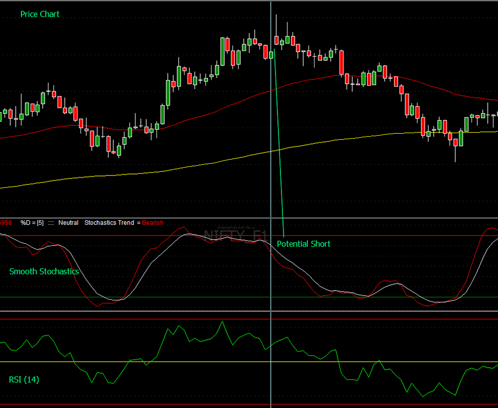
7.1.3 An innovative RSI indicator
See the Nifty Futures chart below and the Normal RSI and a smoothed RSI compound indicator on it.
The smoothened RSI indicator consists of a five period EMA of RSI(7),RSI(14) and RSI(21). A cloud display of smooth RSI(14) and smooth RSI(21) is shown, while smmoth RSI(7) acts as a signal line.
On the other hand the normal RSI(14) tends to give a jerky movement along with the price. You can use the smooth RSI indicator effectively to trade in trending markets as in the example shown. Do not use when RSI is close to 50 and is nearly horizontal. The Amibroker AFL for this indicator is posted below as well.
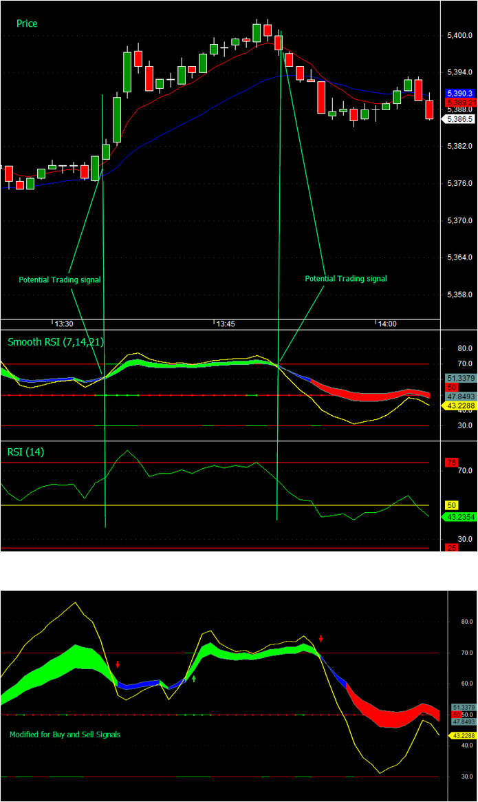
The Amibroker AFL for the above indicators is posted here. It has a parameter to suppress or show the buy/sell signals so that you can use the RSI chart by itself as well.
| rsi_cloud_basic.afl |
7.2 Stochastics
Developed by George C. Lane in the late 1950s, the Stochastic Oscillator is a momentum indicator that shows the location of the close relative to the high-low range over a set number of periods. According to an interview with Lane, the Stochastic Oscillator "doesn't follow price, it doesn't follow volume or anything like that. It follows the speed or the momentum of price. As a rule, the momentum changes direction before price." As such, bullish and bearish divergences in the Stochastic Oscillator can be used to foreshadow reversals. This was the first, and most important, signal that Lane identified. Lane also used this oscillator to identify bull and bear set-ups to anticipate a future reversal. Because the Stochastic Oscillator is range bound, is also useful for identifying overbought and oversold levels
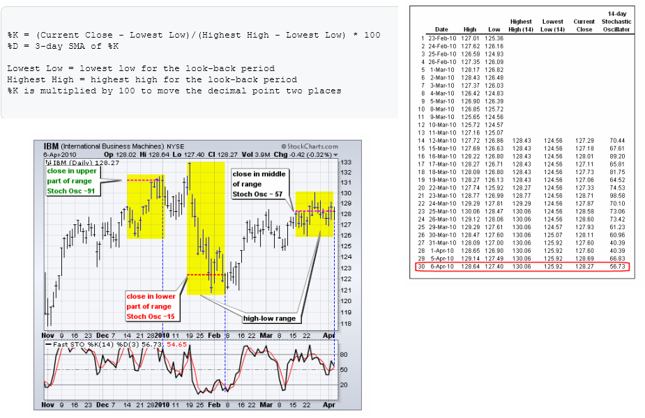
The default setting for the Stochastic Oscillator is 14 periods, which can be days, weeks, months or an intraday timeframe. A 14-period %K would use the most recent close, the highest high over the last 14 periods and the lowest low over the last 14 periods. %D is a 3-day simple moving average of %K. This line is plotted alongside %K to act as a signal or trigger line.
Read the complete article at StockCharts which has also the full credit for this material.
7.2.1 Interpretation
The Stochastic Oscillator measures the level of the close relative to the high-low range over a given period of time. Assume that the highest high equals 110, the lowest low equals 100 and the close equals 108. The high-low range is 10, which is the denominator in the %K formula. The close less the lowest low equals 8, which is the numerator. 8 divided by 10 equals .80 or 80%. Multiply this number by 100 to find %K %K would equal 30 if the close was at 103 (.30 x 100). The Stochastic Oscillator is above 50 when the close is in the upper half of the range and below 50 when the close is in the lower half. Low readings (below 20) indicate that price is near its low for the given time period. High readings (above 80) indicate that price is near its high for the given time period. The IBM example above shows three 14-day ranges (yellow areas) with the closing price at the end of the period (red dotted) line. The Stochastic Oscillator equals 91 when the close was at the top of the range. The Stochastic Oscillator equals 15 when the close was near the bottom of the range. The close equals 57 when the close was in the middle of the range.
While momentum oscillators are best suited for trading ranges, they can also be used with securities that trend, provided the trend takes on a zigzag format. Pullbacks are part of uptrends that zigzag higher. Bounces are part of downtrends that zigzag lower. In this regard, the Stochastic Oscillator can be used to identify opportunities in harmony with the bigger trend.
The indicator can also be used to identify turns near support or resistance. Should a security trade near support with an oversold Stochastic Oscillator, look for a break above 20 to signal an upturn and successful support test. Conversely, should a security trade near resistance with an overbought Stochastic Oscillator, look for a break below 80 to signal a downturn and resistance failure.
The settings on the Stochastic Oscillator depend on personal preferences, trading style and timeframe. A shorter look-back period will produce a choppy oscillator with many overbought and oversold readings. A longer look-back period will provide a smoother oscillator with fewer overbought and oversold readings.
Like all technical indicators, it is important to use the Stochastic Oscillator in conjunction with other technical analysis tools. Volume, support/resistance and breakouts can be used to confirm or refute signals produced by the Stochastic Oscillator
Read the complete article at StockCharts which has also the full credit for this material. Read more about smoothing, overbought and oversold conditions and bull/bear setups there.
Additional References:(click each reference)
Investopedia
Wikipedia
Babypips
Youtube video
7.2.2 Smoothened Stochastics AFL
Enclosed below is the smoothened Stochastics AFL which is a good replacement for the standard Amibroker indicator.
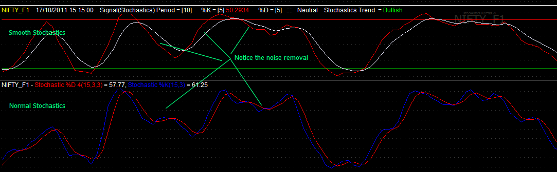
Price chart with Smoothened and normal Stochastics and RSI indicators
| custom_smooth_stochastics.afl |
7.3 Moving Average Convergence Divergence Indicator
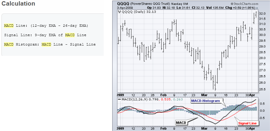
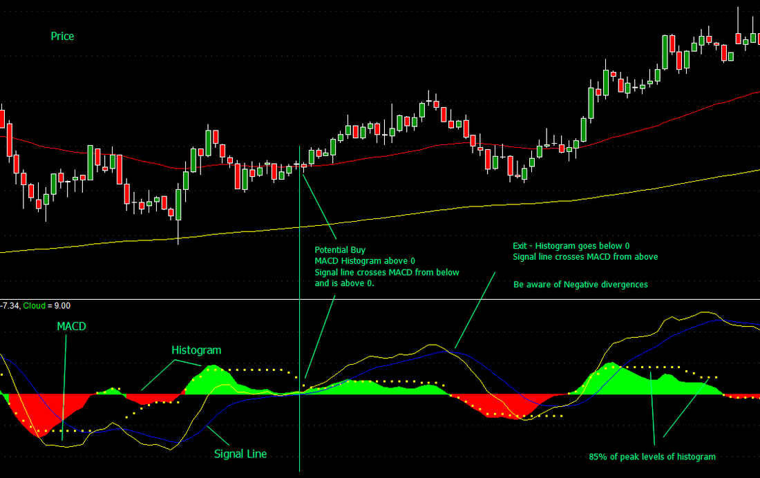
Developed by Gerald Appel in the late seventies, the Moving Average Convergence-Divergence (MACD) indicator is one of the simplest and most effective momentum indicators available. The MACD turns two trend-following indicators, moving averages, into a momentum oscillator by subtracting the longer moving average from the shorter moving average. As a result, the MACD offers the best of both worlds: trend following and momentum. The MACD fluctuates above and below the zero line as the moving averages converge, cross and diverge. Traders can look for signal line crossovers, centerline crossovers and divergences to generate signals. Because the MACD is unbounded, it is not particularly useful for identifying overbought and oversold levels.
Note: MACD can be pronounced as either "MAC-DEE" or "M-A-C-D".
Here is an example chart with the MACD indicator in the lower panel:
Read more and the rest of the article at StockCharts to whom also entire credit for the materials in this subsection goes.
Note: MACD can be pronounced as either "MAC-DEE" or "M-A-C-D".
Here is an example chart with the MACD indicator in the lower panel:
Read more and the rest of the article at StockCharts to whom also entire credit for the materials in this subsection goes.
7.3.1 Interpretation
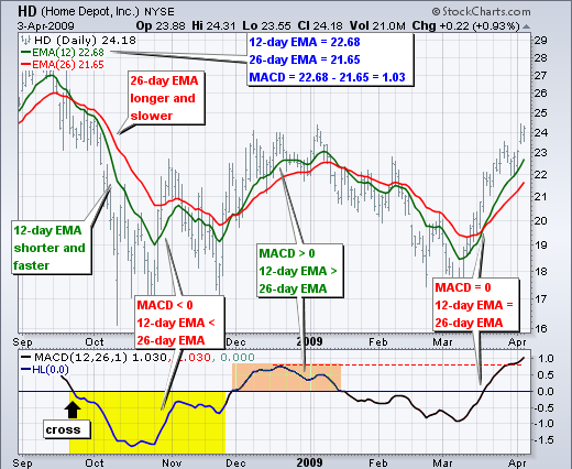
As its name implies, the MACD is all about the convergence and divergence of the two moving averages. Convergence occurs when the moving averages move towards each other. Divergence occurs when the moving averages move away from each other. The shorter moving average (12-day) is faster and responsible for most MACD movements. The longer moving average (26-day) is slower and less reactive to price changes in the underlying security.
The MACD Line oscillates above and below the zero line, which is also known as the centerline. These crossovers signal that the 12-day EMA has crossed the 26-day EMA. The direction, of course, depends on direction of the moving average cross. Positive MACD indicates that the 12-day EMA is above the 26-day EMA. Positive values increase as the shorter EMA diverges further from the longer EMA. This means upside momentum is increasing. Negative MACD values indicates that the 12-day EMA is below the 26-day EMA. Negative values increase as the shorter EMA diverges further below the longer EMA. This means downside momentum is increasing.
In the example above, the yellow area shows the MACD Line in negative territory as the 12-day EMA trades below the 26-day EMA. The initial cross occurred at the end of September (black arrow) and the MACD moved further into negative territory as the 12-day EMA diverged further from the 26-day EMA. The orange area highlights a period of positive MACD values, which is when the 12-day EMA was above the 26-day EMA. Notice that the MACD Line remained below 1 during this period (red dotted line). This means the distance between the 12-day EMA and 26-day EMA was less than 1 point, which is not a big difference.
The MACD indicator is special because it brings together momentum and trend in one indicator. This unique blend of trend and momentum can be applied to daily, weekly or monthly charts. The standard setting for MACD is the difference between the 12 and 26-period EMAs. Chartists looking for more sensitivity may try a shorter short-term moving average and a longer long-term moving average. MACD(5,35,5) is more sensitive than MACD(12,26,9) and might be better suited for weekly charts. Chartists looking for less sensitivity may consider lengthening the moving averages. A less sensitive MACD will still oscillate above/below zero, but the centerline crossovers and signal line crossovers will be less frequent.
The MACD is not particularly good for identifying overbought and oversold levels. Even though it is possible to identify levels that are historically overbought or oversold, the MACD does not have any upper or lower limits to bind its movement. During sharp moves, the MACD can continue to over-extend beyond its historical extremes.
Finally, remember that the MACD Line is calculated using the actual difference between two moving averages. This means MACD values are dependent on the price of the underlying security. The MACD values for a $20 stocks may range from -1.5 to 1.5, while the MACD values for a $100 may range from -10 to +10. It is not possible to compare MACD values for a group of securities with varying prices. If you want to compare momentum readings, you should use the Percentage Price Oscillator (PPO), instead of the MACD.
Read more and the rest of the article at StockCharts to whom also entire credit for the definitions in this subsection goes to. In particular refer to the crossover and histogram interpretations for use in your trading systems.
Additional References:(click each reference)
BabyPips
Investopedia
Wikipedia
And YouTube Video
Posted below is a visually pleasing version of the MACD indicator which users may use in their own charts.
| macd_-_moving_average_convergence_divergence_8.afl |
7.4 Bollinger Bands
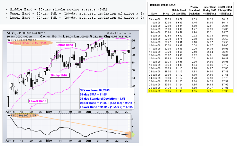
Developed by John Bollinger, Bollinger Bands are volatility bands placed above and below a moving average. Volatility is based on the standard deviation, which changes a volatility increase and decreases. The bands automatically widen when volatility increases and narrow when volatility decreases. This dynamic nature of Bollinger Bands also means they can be used on different securities with the standard settings. For signals, Bollinger Bands can be used to identify M-Tops and W-Bottoms or to determine the strength of the trend. Signals derived from narrowing BandWidth are discussed in the chart school article on BandWidth.
Bollinger Bands consist of a middle band with two outer bands. The middle band is a simple moving average that is usually set at 20 periods. A simple moving average is used because a simple moving average is also used in the standard deviation formula. The look-back period for the standard deviation is the same as for the simple moving average. The outer bands are usually set 2 standard deviations above and below the middle band.
Settings can be adjusted to suit the characteristics of particular securities or trading styles. Bollinger recommends making small incremental adjustments to the standard deviation multiplier. Changing the number of periods for the moving average also affects the number of periods used to calculate the standard deviation. Therefore, only small adjustments are required for the standard deviation multiplier. An increase in the moving average period would automatically increase the number of periods used to calculate the standard deviation and would also warrant an increase in the standard deviation multiplier. With a 20-day SMA and 20-day Standard Deviation, the standard deviation multiplier is set at 2. Bollinger suggests increasing the standard deviation multiplier to 2.1 for a 50-period SMA and decreasing the standard deviation multiplier to 1.9 for a 10-period SMA.
Bollinger Bands reflect direction with the 20-period SMA and volatility with the upper/lower bands. As such, they can be used to determine if prices are relatively high or low. According to Bollinger, the bands should contain 88-89% of price action, which makes a move outside the bands significant. Technically, prices are relatively high when above the upper band and relatively low when below the lower band. However, relatively high should not be regarded as bearish or as a sell signal. Likewise, relatively low should not be considered bullish or as a buy signal. Prices are high or low for a reason. As with other indicators, Bollinger Bands are not meant to be used as a stand alone tool. Chartists should combine Bollinger Bands with basic trend analysis and other indicators for confirmation.
Read more and the rest of the article at StockCharts to whom also entire credit for the materials in this subsection goes.
Additional References and video links (click each link):
Babypips
Bollinger Bands Official Site
Wikipedia
Investopedia
And as usual a YouTube Video (click the link)
Babypips
Bollinger Bands Official Site
Wikipedia
Investopedia
And as usual a YouTube Video (click the link)