14. Swing Trading Techniques
There are many different approaches to trading with trend following being one of the most popular. Trading with the trend is one of the simplest ways of trading in the market. The goal of the trend trader is to identify the current trend, take a position in the trend’s direction and hold that position until the trend has changed. Then, a position is taken in the direction of the new trend.
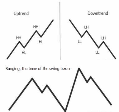
To define a trend recognition – an uptrend is a series of higher peaks and troughs and a downtrend is a series of lower peaks and troughs as shown in the chart on the left.
And then see whats happening on the chart below. The market seems to be moving up but finally endsup nowhere. Most markets end up ranging with no movement for about 30% of the trading period.
A swing trader needs to recognise that ranging periods are part of the normal stock market characteristics and work through by avoiding such periods to the extent possible.
Moving averages are amongst the simplest ways to trade trending markets and details of this has been given in another section Moving Averages and at Swing Trading Guide.
14.1 Non Standard Patterns and how to trade them
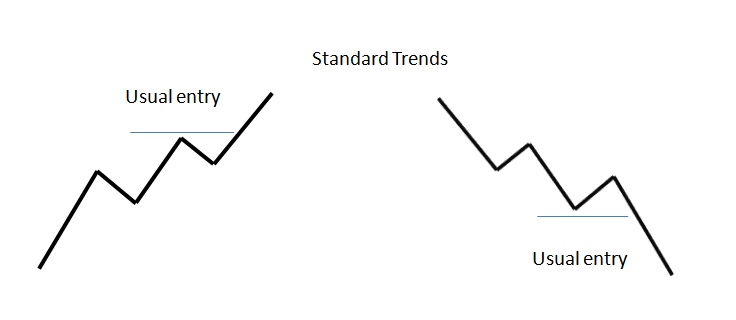
You should be aware of the following non standard patterns and approaches to trade them. In a standard pattern, you would wait for a higher high and a new higher low and trade long above the last high and likewise in a down trend wait for a lower low and a lower high and trade once price crosses below two consecutive lower lows.
Approaches to trade other patterns are given below.
Approaches to trade other patterns are given below.
14.2 Volume and Trends
Stock chart volume also shows us the amount of liquidity in a stock. Liquidity just simply refers to how easily it is to get in and out of a stock.
If a stock is trading on low volume, then there aren't many traders involved in the stock and it would be more difficult to find a trader to buy from or sell to. In this case, we would say that it is illiquid.
If a stock is trading on high volume, then there are many traders involved in the stock and it would be easier to find a trader to buy from or sell to. In this case, we would say that it is liquid.
You can't buy something unless someone is selling it to you and you can't sell something unless someone is buying it from you!
Read more here at - Swing-Trade-Stocks
Read up on supports and resistance in the other section Supports and Resistances
14.3 Stages that Stocks go through
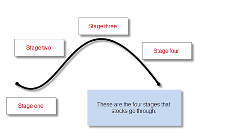
Please explore the reference site Swing-Trade-Stocks for full details. Here, only a summary is provided.
Stage One
Stage 1 is the stage right after a prolonged downtrend. This stock has been going down but now it is starting to trade sideways forming a base. The sellers who once had the upper hand are now beginning to lose their power because of the buyers starting to get more aggressive. The stock just drifts sideways without a clear trend. Everyone hates this stock!
Stage Two
Finally stocks break out into Stage 2 and begins the uptrend. Oh, the glory of stage 2!! Sometimes I have dreams of stocks in Stage 2! This is where the majority of the money is made in the stock market. But here is the funny thing: No one believes the rally! That's right, everyone still hates the stock. The fundamentals are bad, the outlook is negative, etc. But professional traders know better. They are accumulating shares and getting ready to dump it off to those getting in late. This sets up stage 3.
Stage Three
Finally, after the glorious advance of stage 2, the stock begins to trade sideways again and starts to "churn". Novice traders are just now getting in! This stage is very similar to stage 1. Buyers and sellers move into equilibrium again and the stock just drifts along. It is now ready to begin the next stage.
Stage Four
This is the dreaded downtrend for those that are long this stock. But, you know what the funny thing is? You guessed it. Nobody believes the downtrend! The fundamentals are probably still very good and everyone still loves this stock. They think the downtrend is just a "correction". Wrong! They hold and hold and hold, hoping it will reverse back up again. They probably bought at the end of Stage 2 or during Stage 3. Sorry, you lose. Checkmate!
14.4 The Traders Action Zone (TAZ)
Please explore the reference site Swing-Trade-Stocks for full details. Here, only a summary is provided.
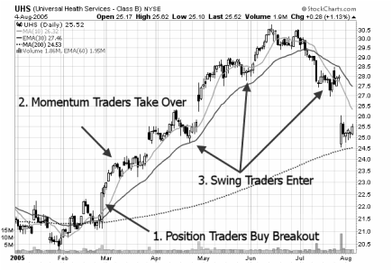
Position Trader: This type of trader is looking to hold stocks for long periods of time. They buy stocks that are first breaking out of basing patterns into a stage two uptrend. This is likely where you will see institutions buying stocks. This buying pressure is what starts the uptrend. They are hoping that the next two groups of buyers will push the stock higher.
Momentum Trader: This type of trader buys stocks that are, well, showing momentum! They buy stocks right after a major move in a stock and hold for a short period of time. They are hopping on a board a fast moving stock looking to capture short term gains quickly.
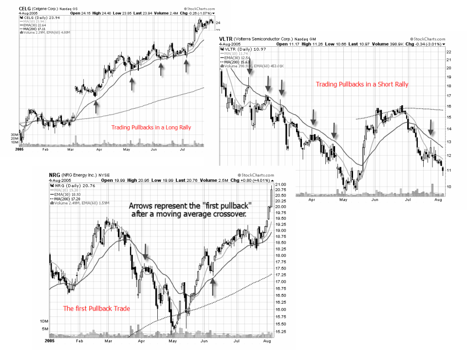
Swing Trader: This is the type of trader referred in this section. You are trading the swings within the trend. Here is a chart that may help you to better see how everything unfolds.
On the chart above you can also see the traders action zone which is the area in between the 10 SMA and 30 EMA. This is where you, as a swing trader look for reversals back to the upside when going long and reversals to the downside when shorting stocks.
It doesn't matter whether you use SMA's or EMA's. There is little difference between the two so don't get caught up in the variations. We are just using these moving averages to create a zone that we will find our entries for long and short positions. We'll cover the entries (and exits) on a separate section of this site.
What is So Special About This Zone? A lot of reversals happen in this area. So in order to create a focus in your trading strategy, it is helpful to narrow down your potential stock setups to one area on a chart. This zone provides a plethora of setups on a daily basis.
We are not really concerned with the moving averages themselves. When a stock pulls back into this zone, look to the left to identify support and resistance, trend lines, candlestick patterns, etc. You are looking for multiple signals all pointing in the same direction.
The TAZ is useful for trading pullbacks. Doesn't it make more sense to buy a stock after a wave of selling has occurred rather than getting caught in a sell-off? Doesn't it make more sense to short a stock after a wave of buying has occurred rather than getting caught in a rally?
Where do you buy a pullback and where do you short a rally? You buy them and short them in the Traders Action Zone (TAZ). See the chart examples below. Likewise, the first pullback in a long or short rally is usually the most effective place to enter. This is the most reliable type of entry into a stock and this is the likely area where institutional money is going to come into the stock. If you only trade one pattern, this should be it! You can get into a stock at the beginning of a trend, at a point of low risk, and you can take partial profits and ride the trend to completion!
The Zig indicator that is posted here helps you to trade pullbacks in swings.
Position Trader: This type of trader is looking to hold stocks for long periods of time. They buy stocks that are first breaking out of basing patterns into a stage two uptrend. This is likely where you will see institutions buying stocks. This buying pressure is what starts the uptrend. They are hoping that the next two groups of buyers will push the stock higher.
Momentum Trader: This type of trader buys stocks that are, well, showing momentum! They buy stocks right after a major move in a stock and hold for a short period of time. They are hopping on a board a fast moving stock looking to capture short term gains quickly.
Swing Trader: This is the type of trader referred in this section. You are trading the swings within the trend. Here is a chart that may help you to better see how everything unfolds.
On the chart above you can also see the traders action zone which is the area in between the 10 SMA and 30 EMA. This is where you, as a swing trader look for reversals back to the upside when going long and reversals to the downside when shorting stocks.
It doesn't matter whether you use SMA's or EMA's. There is little difference between the two so don't get caught up in the variations. We are just using these moving averages to create a zone that we will find our entries for long and short positions. We'll cover the entries (and exits) on a separate section of this site.
What is So Special About This Zone? A lot of reversals happen in this area. So in order to create a focus in your trading strategy, it is helpful to narrow down your potential stock setups to one area on a chart. This zone provides a plethora of setups on a daily basis.
We are not really concerned with the moving averages themselves. When a stock pulls back into this zone, look to the left to identify support and resistance, trend lines, candlestick patterns, etc. You are looking for multiple signals all pointing in the same direction.
The TAZ is useful for trading pullbacks. Doesn't it make more sense to buy a stock after a wave of selling has occurred rather than getting caught in a sell-off? Doesn't it make more sense to short a stock after a wave of buying has occurred rather than getting caught in a rally?
Where do you buy a pullback and where do you short a rally? You buy them and short them in the Traders Action Zone (TAZ). See the chart examples below. Likewise, the first pullback in a long or short rally is usually the most effective place to enter. This is the most reliable type of entry into a stock and this is the likely area where institutional money is going to come into the stock. If you only trade one pattern, this should be it! You can get into a stock at the beginning of a trend, at a point of low risk, and you can take partial profits and ride the trend to completion!
The Zig indicator that is posted here helps you to trade pullbacks in swings.
14.5 4-Patterns for Swing Traders
Check the details here at Swing Trades for this excellent work and use their services, of like what is shown here.
14.5.1 The T-30 Trading Pattern
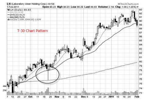
The Setup: The name T-30 (click the link to read more at Swing Trade) refers to a "tail" that slices down through the "30" period exponential moving average. This looks like a hammer candlestick pattern on the chart but it doesn't have to be a perfect hammer to be considered a T-30. Also, the color of the real body is not important. This tail on the chart flushes other traders out of the stock.
Note: There is nothing special about the 30 period moving average. It is just a reference. Look to the left on the chart to determine support and resistance.
When you are trading any kind of tail or hammer pattern, always look for volume to be higher than the previous day. This suggests that many traders were shaken out and demand is picking up. This is important!
The Entry: If you are able to trade during the day then buy the stock on the day of the hammer (tail) near the end of the day. You not need any kind of "confirmation" or anything else. You only need to see that this stock is at a support level and that demand is coming into the stock (volume). That is all the confirmation that you need.
If you cannot trade during the day, then place your buy stop above the high of this hammer day. The next day you will have to check to see if you get filled and then place your stop loss order. You could also use a bracket order.
The Stop Loss OrderThere are two options for the placement of your stop loss order. Each has advantages and disadvantages. You decide what is right for you.
Option 1:Put your stop under the low of the hammer. The advantage to this is that your stop is far away from your entry price and you will not likely get stopped out prematurely. The disadvantage to this is that because your stop is so far away, you will have to buy fewer shares in order to comply with your money management rules.
Option 2:Move down to the 60 minute chart and put your stop under a support area closer near the real body of the candle. The advantage to this is that you get to buy more shares because your stop is closer to your buy price. The disadvantage to this is that because your stop is so close, you may get stopped out more often, before a big move happens.
14.5.2 Ghost Town Chart Pattern
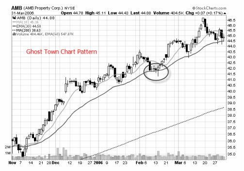
The SetupThe name "ghost town" (click the link to read more at Swing Trade) refers to a low volatility setup. And what follows low volatility? High volatility! This repeats over and over again on every chart - in every time frame.
With this chart pattern, you will see pullbacks into the Traders Action Zone that end in narrow range candles. These candles are also known as stars or doji's. Combine these price patterns with low volume and you have a winning trade in the making!
Note: In candlestick terminology, stars, technically have to gap away from the previous candle to be called stars. I don't find this to be necessary to trade them.
How to Trade This PatternThis can be tricky. When you have a potentially explosive situation, the stock can be prone to whipsaws. Here is how to avoid them.
The EntryWith this pattern, you want to avoid just putting your buy stop above the previous high. You will get likely get filled prematurely!
Method 1: Put your buy stop above the high of the highest narrow range candle. In the first example (long), there are three candles that I highlighted. The middle one has the highest high. Put your buy stop in above that. This is reversed for short positions.
Method 2: Wait for another pattern to develop before you enter the stock. Did you notice the T-30(s)?
Method 3: Move down a time frame to the 60 minute chart and wait for it to breakout. Many times the 60 minute chart will give you an early warning sign that the stock is about to break (in one direction or another).
The most difficult part of this pattern is the entry. Many times the stock will move up and then sell off. Or, it will move down, and then rally. This can cause whipsaws.
The advantage to this pattern is that your stop can be very close to your buy price, so your risk is small. If you get stopped out, consider another entry. The move that follows is usually worth it!
14.5.3 Swing Trap Pattern
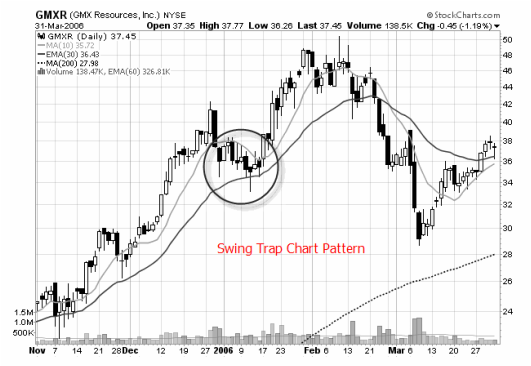
Read more at Swing Trade Stocks.
This is what is happening in the pattern:
This stock rallies hard to $42.00 (see chart). It then pulls back real nicely into the TAZ. This would have been a nice pullback to trade. But look at what happens next.
It rallies up a little bit, but then it fails and goes right back down. This traps the swing traders who are long this stock. They put their stop loss orders under the first rally attempt. But, when the stock fell, it took out their stop loss orders.
Now that the majority of sellers are out of the trade, the stock can rally.
And that's exactly what it did.
How To Trade This Pattern? The key with this chart pattern is to look for the "shakeout". The final swing MUST go below the low of the first swing. Many times, this final swing will end in a hammer. This hammer will take out all of the stop loss orders and you are ready to go!
The Entry: Wait for a candlestick pattern to develop on the final swing (in this case, it was a hammer). Then you can buy the stock on the day of the pattern, or wait, put in a buy stop above the high of the candlestick pattern.
It's up to you how you want to enter the stock.
14.5.4 Side Trap Chart Pattern
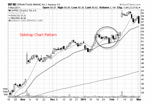
Please read more at Swing Trade Stocks. This is only a summary.
How to Trade It : There are three components to trading this chart pattern:
- consolidation
- breakdown
- reversal
The Entry You want to establish a position with this stock on the day of the reversal candle. But, you do not want to trade just any reversal candle. You want the candle to be strong one. Make sure it closes at least halfway into the range of the breakdown candle. This will show up as a piercing candlestick pattern or a bullish engulfing candlestick pattern (see the examples above).
Taking Profits Nothing special here. Just trail your stops using your favorite exit strategy. However, when the stock market offers you a gift - take it! If the stock explodes, and goes up 15% in a couple of days, at least take partial profits and trail your stops on the rest.
Keep in mind that you are wanting to see this stock move above that sideways trading pattern (consolidation). That is where the explosiveness will kick in.
14.6 Swing trading in Action
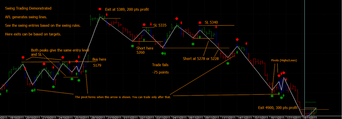
Here is a simple swing trading indicator that uses a breakout trading principle. The same indicator can be used with moving averages to trade pullbacks, and and example of that follows.
The indicator is drawn with the Amibroker Zig function. However, the Zig function has a lag from the formation of the pivot to the indication of the pivot. This has been circumvented, by showing when the pivot is formed with arrows as shown in the chart below for the Nifty.
Four trades are shown and they demonstrate the uneven formation of the swings and the entry levels.
In the first trade entered at 5179, we have two entry inferences. The first peak is higher than the next peak, while two higher lows are made. The entry point and SL is the same for both the entry levels. That trade allows an exit at 200 pts profit.
The next short entry fails, as a lower trough is formed, but cancelled by a higher high immediately afterwards. One could play safe and wait for the price to fall below the second trough and then enter, which is actually the entry for the third trade, which is successful and makes 300 pts.
Review this carefully along with the swing rules and exceptions and how they are handled.
Included is the AFL which generated the indicator. The percentage change parameter can be varied to manage scrips with different prices and different time frames. The percentage change used for this chart is 0.6.
Caution : Use swing trading for highly liquid scrips and indices only so that the normal rules are followed. Less liquid scrips will give frequent whipsaws.
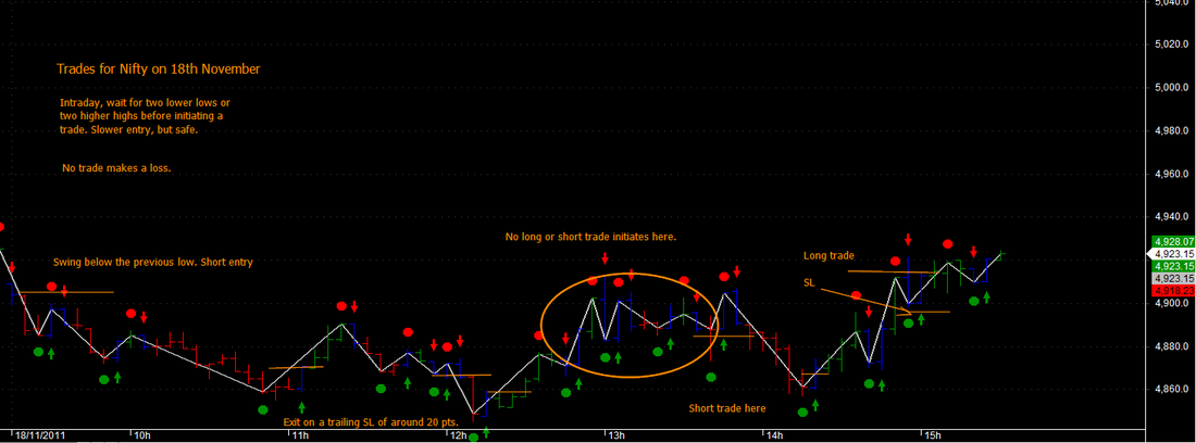
While the chart further above is on an hourly time frame, see the same chart for a 5 minute Nifty movement on 18th November. It is always safe to enter a trade after two higher highs for a long entry and two lower lows for a short entry, particularly for intraday trading to avoid whipsaws.
| zig_indicator.afl |
14.7 Example of Pullback Trading
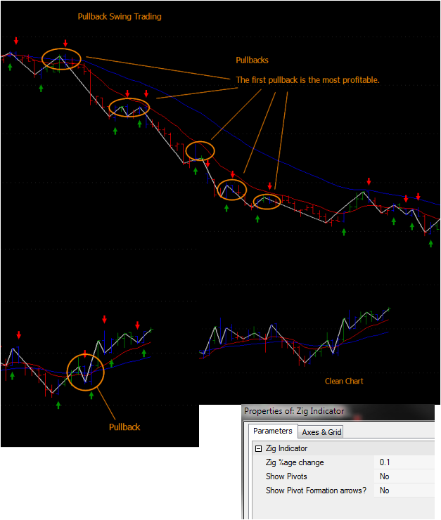
Here is an example of Pullback trading using the Zig Indicator AFL.
Note that you can suppress the Pivots, the pivot formation time indication arrows or the EMA lines, by selecting the appropriate parameters in the AFL.
Simple tweaks, that help to get the charts uncluttered.
See the 10/30 EMA charts and the trading zone (the first pullback is in the TAZ in the short as well as the first pullback in the long rally as well).
14.7 Bear And Bull Traps In Swing Trades
Read this excellent article by Howard Friend to know more.
| swing_trading_techniques.pdf |
14.8 Fibonacci Retracements
Put here only for completeness. Please read the full details at Swing-Trade-Stocks.(click the link). I will add AFL's that use this principle soon.
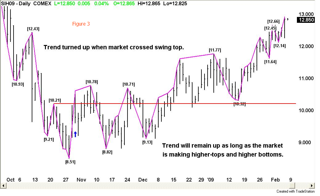
14.9 Gann Swing Charts for Trading
This is an interesting concept from James A. Hyerczyk reported in Trading Markets (click the link). And I am implementing it for the benefit of budding TA practitioners here.
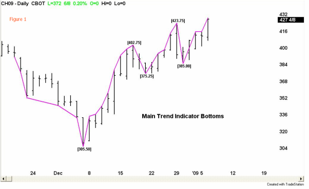
When writing about pattern under the context of Gann, the Gann Swing chart is the first pattern which comes to mind. The Gann Swing chart is also often referred to as the Gann Trend Indicator. Creating a Gann Swing Chart is an important first step in using Gann analysis because it identifies the trend and the important tops and bottoms from which to draw the Gann angles. In addition, the chart provides valuable information to the trader such as size and duration of the swings. This information helps the trader find price and time targets and to identify when the market is ahead or behind target.
Gann Swing Charts can be created for the minor trend or the main trend. Some analysts prefer the minor, intermediate and main trend outlook. For this article we will use the 2-bar swing chart as our main trend indicator. A 2-bar swing chart measures swings only after the market has made two consecutive higher-highs or two-consecutive lower-lows. A minor or 1-bar swing chart would follow the one day swings of the market.
Before we learn how to construct the 2-bar swing chart let's look at some of the benefits it has over a minor swing chart.
1. Main trend chart opportunities occur less frequently than minor trend opportunities. This keeps the cost of trading to a minimum.
2. Trading less frequently than the minor trend indicator makes the trader less likely to be whipsawed and also makes the possibility of a long series of losses less likely.
3. Main trend trading opportunities develop more slowly and more predictably than minor trend opportunities. This give the trader time to watch the formation and to make adjustments when necessary.
4. Although the same technique is required to create the main trend chart, and the minor trend chart, the amount of time devoted can be less especially if the market is in a steep uptrend or downtrend.
5. The mental exhaustion caused by frequently changing direction, overtrading, and taking a series of losses is not as common for the main trend trader as it is for the minor trend trader.
CONSTRUCTION
The main trend chart can be used to identify the main trend tops and bottoms for any time period. In order to avoid confusion about whether we are speaking exclusively of the monthly, weekly, daily, or intraday charts, we call each trading time period a bar.
The main trend swing chart, or 2-bar chart, follows the 2-bar movements of the market. From a low price each time the market makes a higher-high than the previous bar for two consecutive time periods, a main trend line moves up from the low two bars back to the new high. This action makes the low price from two bars back a main bottom.
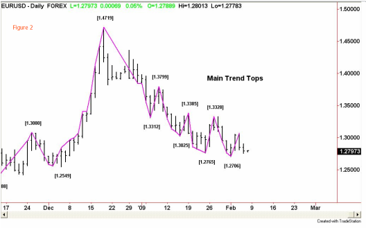
From a high price each time the market makes a lower-low than the previous bar for two consecutive time periods, a main trend line moves down from the high two bars back to the new low. This action makes the high price from two bars back a main top.
Once the first main top and bottom is formed, the trader can anticipate a change in the main trend. Starting from the first day of trading, if the main trend line moves up to a new high, this does not mean that the main trend has turned up. Conversely, if the first move is down, this does not mean the main trend is down. The only way for the main trend to turn up is to cross a main top, and the only way for the main trend to turn down is to cross a main bottom.
In addition, if the main trend is up and the market makes a main swing down that does not take out the previous main swing bottom, this is a correction. If the main trend is down and the market makes a main swing up that does not take out the previous main swing top, this is also a correction. A market is composed of two types of up and down moves. The main swing chart draw attention to these types of moves by identifying trending up moves and correcting up moves, as well as trending down moves and correcting down moves.
In summary, when implementing the main swing chart, the analyst is merely following the two-bar up and down movements of the market. The intersection of an established downtrending line with a new uptrending line is a main swing bottom. The intersection of an established uptrending line with a new downtrending line is a main swing top. The combination of main swing tops and main swing bottoms forms the main trend indicator chart. The crossing of a main swing top changes the main trend to up. The penetration of a main trend bottom changes the main trend to down. The market is composed of main uptrends, main downtrends, and main trend corrections.
James A. Hyerczyk is a registered Commodity Trading Advisor with the National Futures Association. Mr. Hyerczyk has been actively involved in the futures markets since 1982 and has worked in various capacities from technical analyst to commodity trading advisor. Using W. D. Gann Theory as his core methodology, Mr. Hyerczyk incorporates combinations of pattern, price and time to develop his daily, weekly and monthly analysis.
His published works include articles for Futures Magazine, Trader's World, SFO Magazine, Forex Journal, and Commodity Perspectives (Commodity Research Bureau), and, his book Pattern, Price & Time published by John Wiley & Sons, Inc. in 1998.Full credit to the author and TradingMarkets.com for this work.
14.10 Gann Swing Charts Implemented
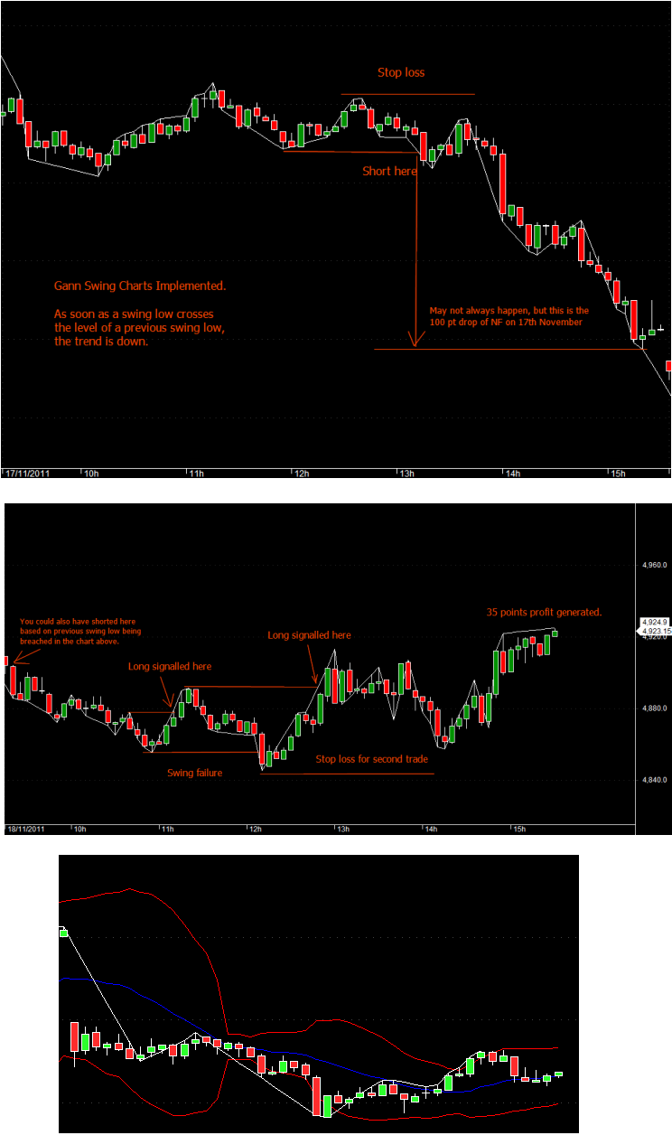
And here is the implementation of the 2 bar Gann Swing showing two examples, the Nifty downtrend on 17th and the trades on the 18th. Notice, that the short of 17th could have been carried to its logical conclusion at 4850 through an overnight trade, by following the downtrend logic.
Whats good about Gann 2 bar Swing charts? They allow entry into the major trend changes and help to ignore immediate whipsaws. Of course the whipsaws cannot be avoided, but are significantly reduced.
Modified on 21/11 to include Bollinger Bands (selectable).
The Amibroker AFL incorporating this is attached below.
Next step will be to convert this AFL into a trading system.
| gann_2_bar_swing_charts.afl |
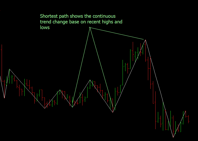
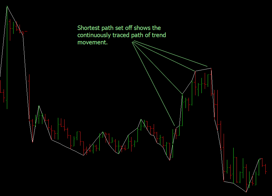
14.11 Gann Swing Charts - 2 and n bar charts (New!!)
The swing AFL has been changed to allow anywhere from 1 to 5 bars Gann swing charts. You also have the option of seeing continuous or shortest path swing charts. The examples below illustrate the new implementation. The selection of shortest path and n bars is provided in the parameters box. The logic also accomodates breakouts of price above or below a swing which may be ignored normally, because they dont comply to the swing logic.
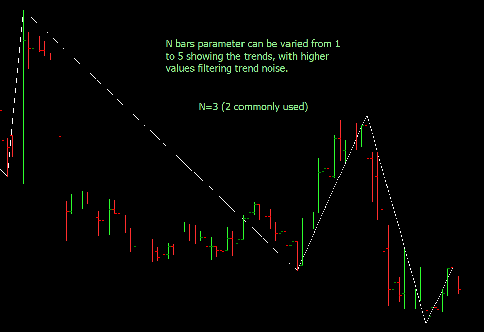
| gann_2_and_n_bar_swing_charts.afl |
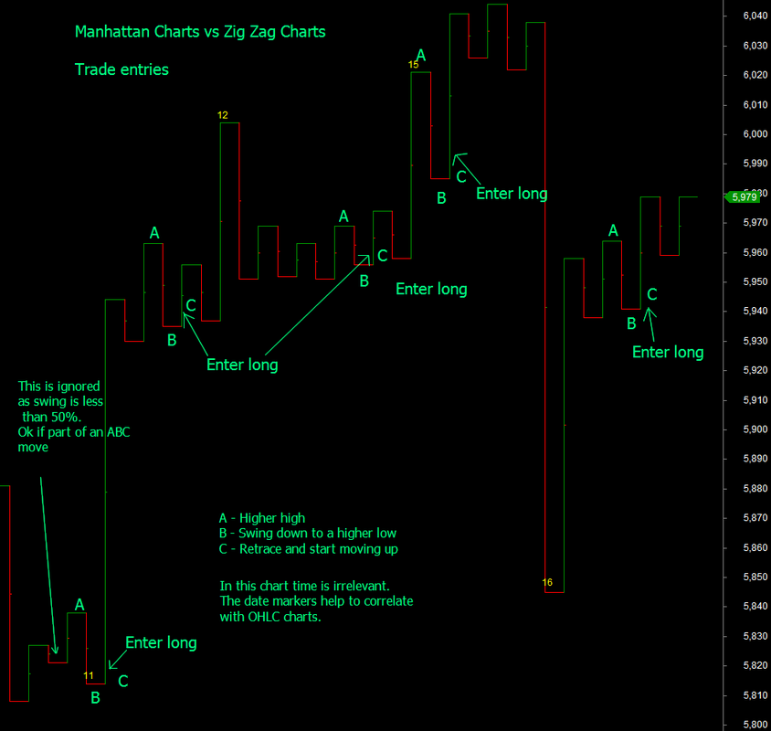
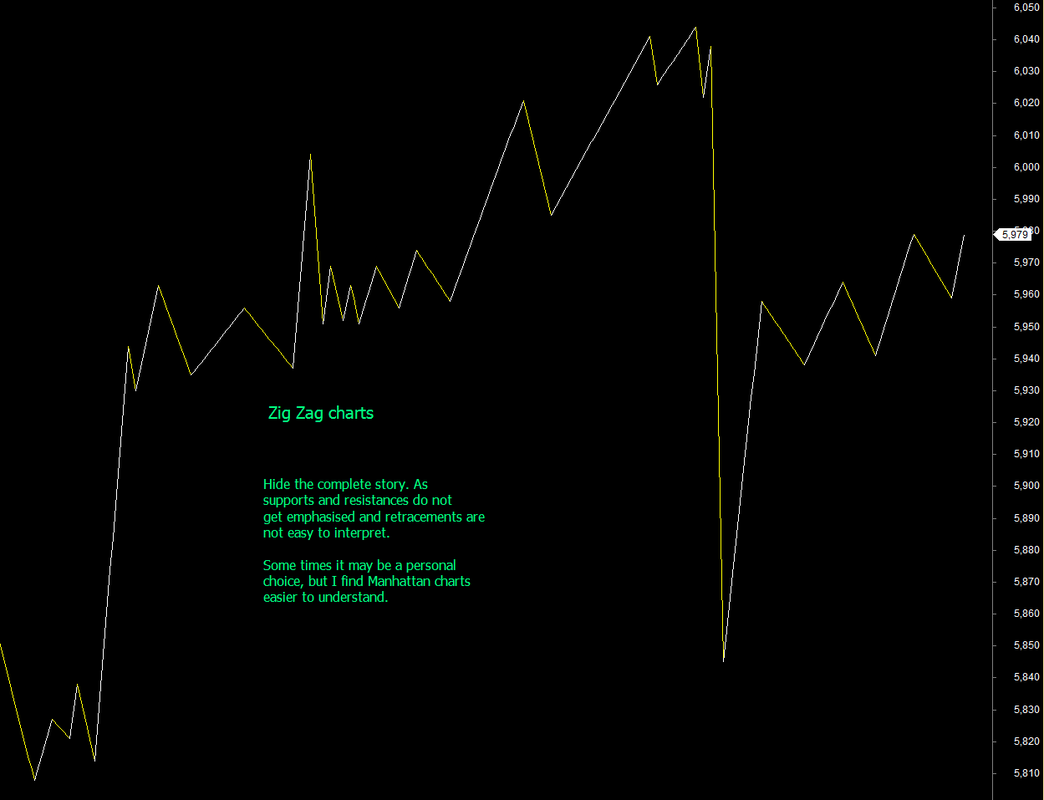
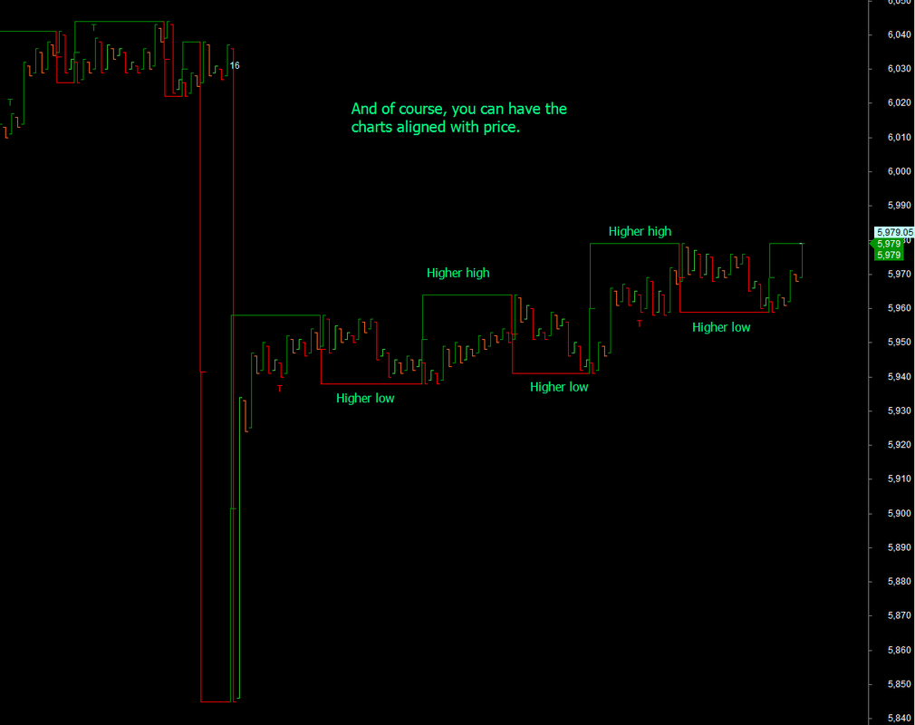
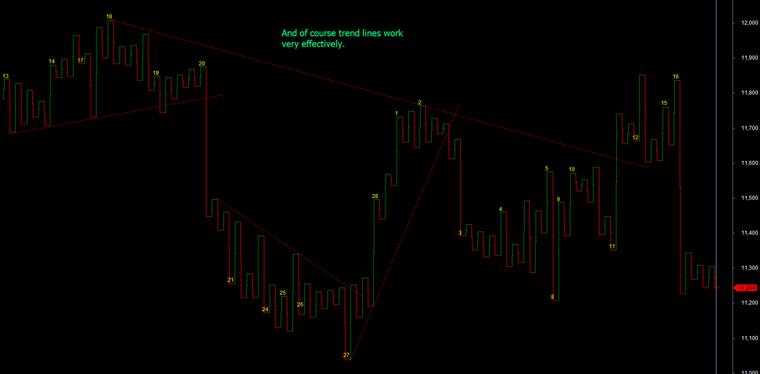
14.12 Manhattan Swing Charts
Manhattan swing charts are a replacement for traditional zig zag charts and personally, I have found that it is easier to follow trends and find out new trades. The Manhattan swing chart is called so, because the swings are represented by vertical rectangles, that resemble sky scrapers/towers, that dot a typical Manhattan skyline.
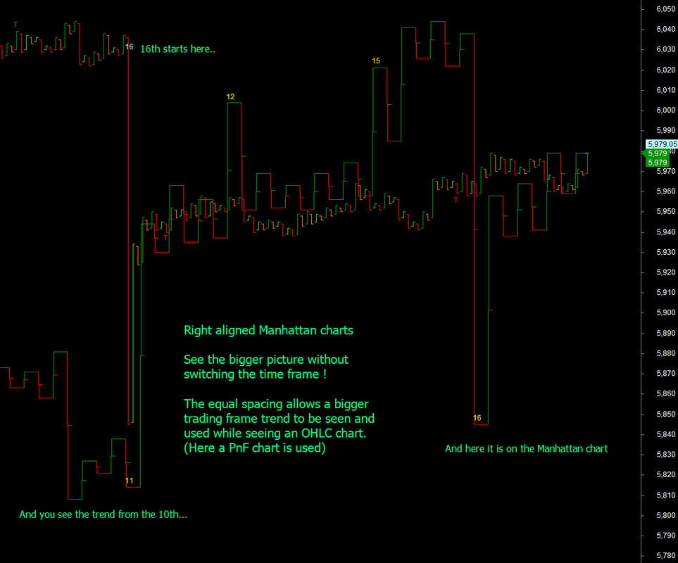
Construction : Once you have identified peaks and troughs, just plot these on a chart with each peak representing the terrace of the tower and each trough representing the basement of the tower. Vertical lines connect the peaks and trough. While it is not necessary to have equal spacing between the towers, and you can have them aligned to the OHLC charts, it becomes very easy to see the larger trends, when you have the Manhattan chart right aligned to the current price chart. They may look similar to the Japanese Kagi charts (see next section), but are different in logic.
See the examples below and see the convenience of these charts. All swing rules are extremely easy to apply and you will understand to do your own tweaks as shown for the first trade signal below.
Like PnF charts, these can filter out time and show the trend that is really active.
You can of course see the charts aligned with OHLC time as well and shown below.
This is some of the new knowledge that is discussed in the mentored trading service.
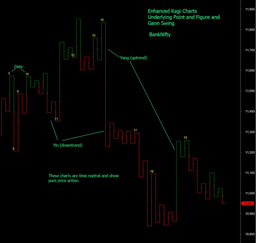
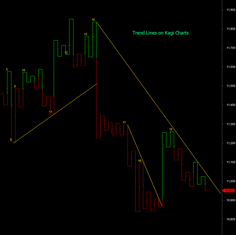
14.13 Kagi Charts
Kagi Charts like Point and figure charts use a reversal step either defined in absolute price increments or %age of price. In either case, so long as price movement from a base level does not reverse, more than the price increment chosen, a vertical line is drawn up for an up trend and down for a down trend with the increment size chosen. An uptrend line is typically drawn thicker than the downtrend line. On price reversal, a horizontal step is made before the price is reversed in the opposite direction.
For example if price increment is 4 and base price is 100, if price moves to 109. A vertical up line is drawn till 108 (two increments). Another increment is drawn, when price moves to 112. If price now reverses to 108 or lower, a horizontal step is made and a vertical line drawn to 108.
If a vertical line trending down crosses a previous trough - horizontal step - or window in Kagi terminology, the trend is said to reverse to down. Likewise, an uptrending vertical line, when crossing a previous peak - horizontal step - or window, the trend is said to reverse to up. (see the charts below).
As these are also time neutral charts, at TradeWithMe, we have built these charts by removing market noise using underlying point and figure data to construct the price movement swings using Gann principles and then constructed the Kagi charts. The result is amazingly clear depiction of trend.
More information on Kagi Charts are provided in the enclosed article by Jayanthi Gopalakrishnan in Stocks and Commodities. All rights rests with the original publishers. Kagi Chart AFL's are provided to those who are part of the mentored trading program with TradeWithMe and also available as separately priced resources. Request details through the contact form.
| kagi.pdf |
14.14 Renko Charts
Renko charts are similar to Point and Figure Charts as they use a fixed brick size for the chart preparation. Noise cancellation is achieved, by defining that so long as price remains within + - brick size from the base price (price here is close price), there is no change in the chart. If the price moves up twice and less than 3 brick size, 2 bricks will be drawn, with each brick offsetted to the right with each other. Likewise, when price moves down, bricks are drawn in a similar manner. The only condition for direction reversal that is imposed is that reversal should occur with a price movement of at least twice the brick size. (in a way similar to 2 box reversal in Point and figure terminology). Use of close price and this asymmetrical reversal, ensures that the chart shows a good trend of the market direction. Buys and sells are triggered when direction changes. It is possible to apply other rules such as retracement and support/resistances as well on these charts. See the example below :
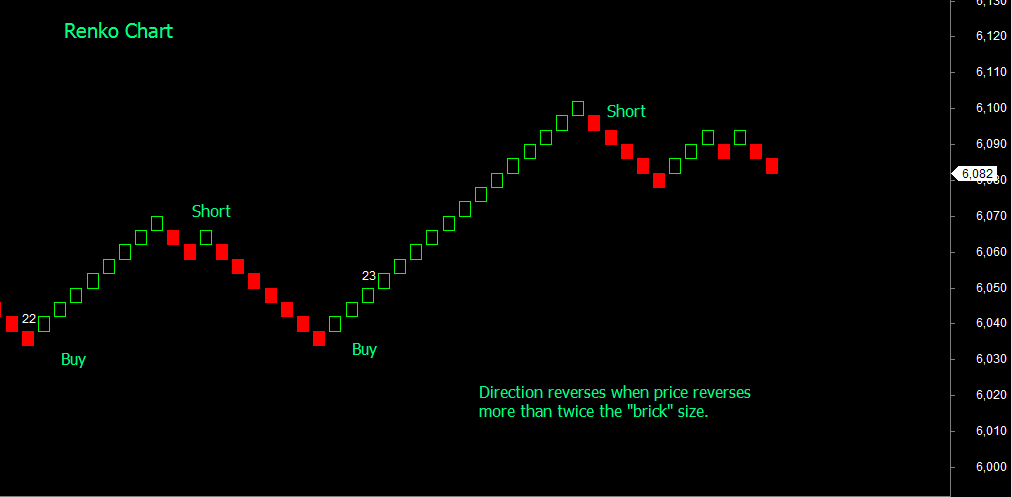
The chart above has an enhancement to show the day change on the chart itself. The chart by itself does not have any time axis. Amibroker AFL for preparing a highly efficient chart are available to those who are part of the mentored trading programs with TradeWithMe. It is also available on a priced basis. Request details through the contact form.
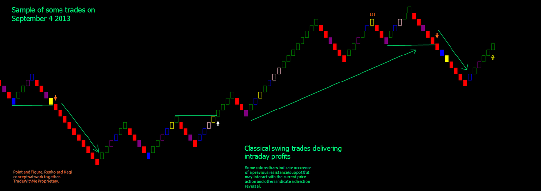
14.14 Combining Point and Figure, Renko and Kagi
Underlying principles in these methods apply swing principles in charts that dont have any time element. Therefore, the concepts of price reversal from PnF, equal sized boxes or bricks from Renko and trend from Kagi can be combined together to get a fairly simple and interesting view of price. In its basic form, this is demonstrated in the picture below.
14.15 Elliott Waves (Work In Progress)
This is intended just to be an introduction to Elliot Waves and links to more comprehensive information will be added here.
The material here is fully acknowledged to http://www.swing-trade-stocks.com
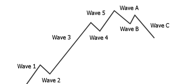
The Elliot wave describes price movement in a series of motive and corrective phases as below.
The motive phase of an Elliott wave cycle consists of five waves. You can see the waves labeled on the chart above numbered 1 through 5. Think of the motive phase as a detailed view of an uptrend.
The corrective phase is labeled on the chart above as Wave A, Wave B, and Wave C. This is the phase that "corrects" the uptrend. We are not really concerned with this phase, but I wanted you to learn the basic cycle!
Wave One
This wave breaks the previous downtrend and begins a new uptrend. This marks the beginning of the trend. You want to start watching for a pullback when this wave starts.
Wave Two
The pullback! Now you want to start looking for an entry using candlestick patterns. This sets up our First Pullback scenario. You are hopping on board at the beginning of an uptrend.
Wave Three
Wave three of an Elliott wave cycle is the longest and the strongest of all five waves! That is why we want to get on board during wave two (the pullback) right as wave three is beginning to unfold.
When you can find stocks that are beginning a wave three, you want to hold on to your position for a longer time frame. Don't treat is at a little swing trade, instead, treat it as a trend trade. You want to ride this powerful wave to completion! Why? Because you will make the most amount of money in the least amount of time. Ya, gotta love that!
Wave Four
This wave is pretty disappointing for those that bought this stock too late. The stock moves a lot slower and is a signal that the best part of the trend is over.
Wave Five
Again, this wave is usually sluggish and not near as dynamic as the third wave of an Elliott wave cycle. This also marks the last burst of buying before a new downtrend starts.
Wave A, B, and C
These waves finally start the downtrend. You will notice that wave A looks like just a regular pullback. Nope. This is a bull trap. You will also notice that wave B doesn't get higher than wave 5. This is the first pullback of the downtrend and wave C is the third wave in a downtrend!! This is where you would look for shorting opportunities.
This is the basic structure of an Elliott wave pattern. There is a lot more to Elliott wave theory, but some of it can get very complicated. Also, sometimes it can be very difficult to identify exactly which part of the cycle a stock is in!
A very interesting flash animation on Elliot Waves by Babu Kothandaraman (see file attached below).
Here are some more Elliott Wave articles that you might enjoy reading...(to be added).
Here is an Elliot Wave AFL from the AFL library (click the link).
See this : http://www.youtube.com/watch?v=mBO5TXxVD2Q
| 1_ew_counts.exe |