3. Basics of Data Analysis - The start of our journey
3.1 Introduction:
Updated 12th August 2014
Data from the markets presents itself in its more basic form as a "tick". This is the smallest of data units that can exist and corresponds to each transaction that occurs. If you take an instrument like the Nifty Futures, there will be millions of transactions that occur in a day. Can we plot all of these to do our analysis? And will our data provider provide this information?
The answer is obviously "NO". Its impractical and the data volumes can be unmanageable for highly active instruments.
So what is done? The first is a sampling approach, where the data provider picks his "Tick" to be a representative transaction that occurs in one second. This is the most common of the approaches that data providers use and is usually sufficient for trading purposes.
3.2 How can we analyse data?
We could plot ticks or use some form of statistical analysis? Well, the experts before us have done a lot of work, and have come up with a number of different approaches. Lets list a few representative ones are given below. We follow that up with Support and Resistance concepts and Trendlines. Chart patterns themselves is the subject of another sub section where we will deal with common chart patterns that can be used in trading.
3.3 Candle Stick Charts :
These have become the most popular of all data representations and are the basic elements of most modern TA methods. Back in the day when Godzilla was still a cute little lizard, the Japanese created their own old school version of technical analysis to trade rice. That's right, rice.
A westerner by the name of Steve Nison "discovered" this secret technique called "Japanese candlesticks", learning it from a fellow Japanese broker. Steve researched, studied, lived, breathed, ate candlesticks, and began to write about it. Slowly, this secret technique grew in popularity in the 90s. To make a long story short, without Steve Nison, candlestick charts might have remained a buried secret. Steve Nison is Mr. Candlestick. (credit www.babypips.com)
Read more : http://www.babypips.com/school/what-is-a-japanese-candlestick.html
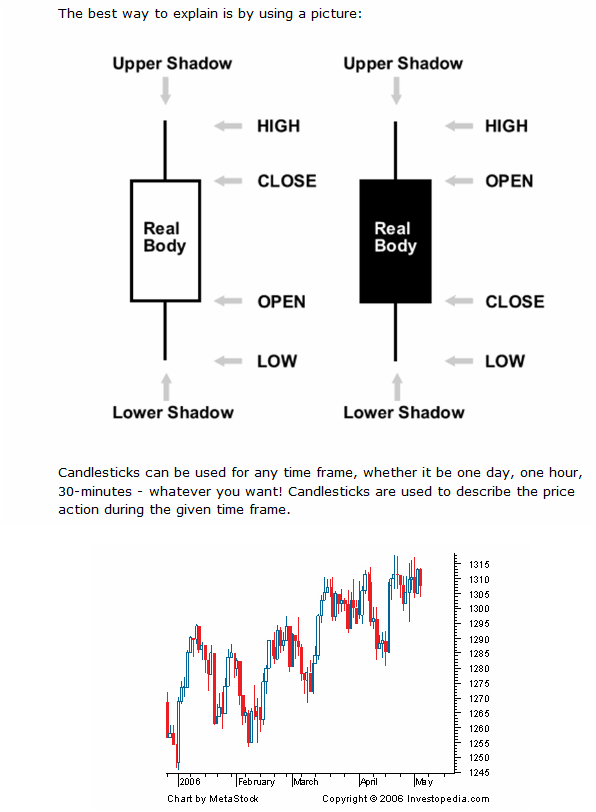
The candlestick chart is similar to a bar chart, but it differs in the way that it is visually constructed. Similar to the bar chart, the candlestick also has a thin vertical line showing the period's trading range. The difference comes in the formation of a wide bar on the vertical line, which illustrates the difference between the open and close. And, like bar charts, candlesticks also rely heavily on the use of colors to explain what has happened during the trading period. A major problem with the candlestick color configuration, however, is that different sites use different standards; therefore, it is important to understand the candlestick configuration used at the chart site you are working with. There are two color constructs for days up and one for days that the price falls. When the price of the stock is up and closes above the opening trade, the candlestick will usually be white or clear. If the stock has traded down for the period, then the candlestick will usually be red or black, depending on the site. If the stock's price has closed above the previous day’s close but below the day's open, the candlestick will be black or filled with the color that is used to indicate an up day.
Read more: http://www.investopedia.com/university/technical/techanalysis7.asp#ixzz1bxgab8lJ
(To read more, see The Art Of Candlestick Charting - Part 1, Part 2, Part 3 and Part 4.)
3.4 Bar Charts:
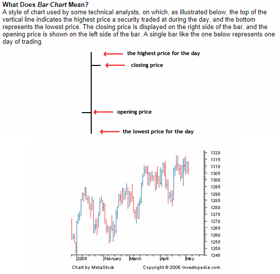
As their name indicates these are vertical bars with open and close indicated in a slightly different way from candlesticks. The bar chart expands on the line chart by adding several more key pieces of information to each data point. The chart is made up of a series of vertical lines that represent each data point. This vertical line represents the high and low for the trading period, along with the closing price. The close and open are represented on the vertical line by a horizontal dash. The opening price on a bar chart is illustrated by the dash that is located on the left side of the vertical bar. Conversely, the close is represented by the dash on the right. Generally, if the left dash (open) is lower than the right dash (close) then the bar will be shaded black, representing an up period for the stock, which means it has gained value. A bar that is colored red signals that the stock has gone down in value over that period. When this is the case, the dash on the right (close) is lower than the dash on the left (open).
Read more: http://www.investopedia.com/university/technical/techanalysis7.asp#ixzz1bxfb2JKF (Credit www.investopedia.com)
3.5 Line Charts:
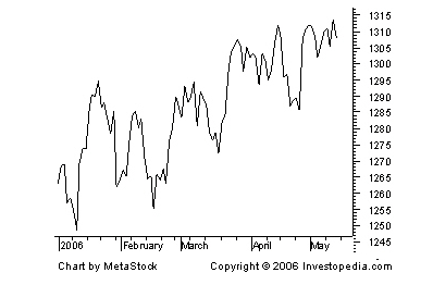
The most basic of the four charts is the line chart because it represents only the closing prices over a set period of time. The line is formed by connecting the closing prices over the time frame. Line charts do not provide visual information of the trading range for the individual points such as the high, low and opening prices. However, the closing price is often considered to be the most important price in stock data compared to the high and low for the day and this is why it is the only value used in line charts.
Read more: http://www.investopedia.com/university/technical/techanalysis7.asp#ixzz1bxh1IZLc
3.6 Point and Figure Charts
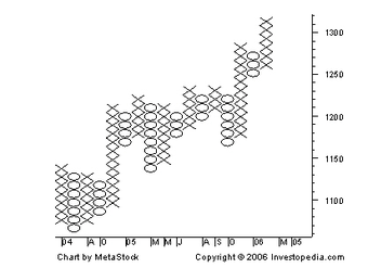
The point and figure chart is not well known or used by the average investor but it has had a long history of use dating back to the first technical traders. This type of chart reflects price movements and is not as concerned about time and volume in the formulation of the points. The point and figure chart removes the noise, or insignificant price movements, in the stock, which can distort traders' views of the price trends. These types of charts also try to neutralize the skewing effect that time has on chart analysis. (For further reading, see Point And Figure Charting.)
When first looking at a point and figure chart, you will notice a series of Xs and Os. The Xs represent upward price trends and the Os represent downward price trends. There are also numbers and letters in the chart; these represent months, and give investors an idea of the date. Each box on the chart represents the price scale, which adjusts depending on the price of the stock: the higher the stock's price the more each box represents. On most charts where the price is between $20 and $100, a box represents $1, or 1 point for the stock. The other critical point of a point and figure chart is the reversal criteria. This is usually set at three but it can also be set according to the chartist's discretion. The reversal criteria set how much the price has to move away from the high or low in the price trend to create a new trend or, in other words, how much the price has to move in order for a column of Xs to become a column of Os, or vice versa. When the price trend has moved from one trend to another, it shifts to the right, signaling a trend change.
What we are seeing here is a 3 box reversal point and figure chart, which is amongst the most popular of charts that is used. There are 1 box, 2 box, 5 box and 7 box versions too, with different objectives.
Read more: http://www.investopedia.com/university/technical/techanalysis7.asp#ixzz1bxiGSTid
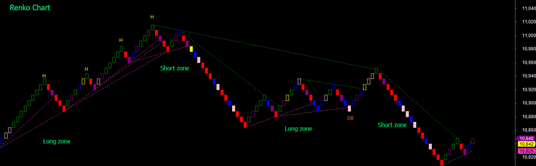
Other Approaches: Renko and Kagi Charts
Renko and Kagi charts are two more Japanese chart representations that do not use time as an axis and are drawn purely on price movement.
Renko and Kagi charts are variations of Point and Figure charts (Pnf). Here is how:
In PnF charts, data is aggregated by a box, a unit of measure of the increments how price will move. If we use a box size of 2 units (say $) and a reversal of 3 boxes, if price currently in an uptrend and at $ 10. If price moves to $ 11 nothing happens, the height of the PnF bar is at $10. However, if price moves to 12 or 13, the PnF bar lengthens by 1 box. If price moved by 6 $ from $ 10 to $16, 3 boxes would get added. Likewise for reversal, price needs to move at least $ 2 x 3 = $6 in the opposite direction for price to reverse and a new PnF bar to be drawn.
In Renko charts, box is called a brick and reversal is measured in number of bricks. So the above PnF chart will have a brick size of 2 units and reversal of 3 units in Renko. Instead of vertical columns of X's and O's, the Renko chart draws bricks at 45 degree angles, up for an uptrend, usually also in a empty color and downwards at 45 degrees in a downtrend in a fully filled configuration. The effect of this is that Renko charts simply expand the PnF bars rapidly to fill up the users viewing screen and may cause the analyst to lose perspective. However, these charts are good to identify supports and resistances and trends to some extent.
See below for an example of a Renko chart.
When first looking at a point and figure chart, you will notice a series of Xs and Os. The Xs represent upward price trends and the Os represent downward price trends. There are also numbers and letters in the chart; these represent months, and give investors an idea of the date. Each box on the chart represents the price scale, which adjusts depending on the price of the stock: the higher the stock's price the more each box represents. On most charts where the price is between $20 and $100, a box represents $1, or 1 point for the stock. The other critical point of a point and figure chart is the reversal criteria. This is usually set at three but it can also be set according to the chartist's discretion. The reversal criteria set how much the price has to move away from the high or low in the price trend to create a new trend or, in other words, how much the price has to move in order for a column of Xs to become a column of Os, or vice versa. When the price trend has moved from one trend to another, it shifts to the right, signaling a trend change.
What we are seeing here is a 3 box reversal point and figure chart, which is amongst the most popular of charts that is used. There are 1 box, 2 box, 5 box and 7 box versions too, with different objectives.
Read more: http://www.investopedia.com/university/technical/techanalysis7.asp#ixzz1bxiGSTid
Other Approaches: Renko and Kagi Charts
Renko and Kagi charts are two more Japanese chart representations that do not use time as an axis and are drawn purely on price movement.
Renko and Kagi charts are variations of Point and Figure charts (Pnf). Here is how:
In PnF charts, data is aggregated by a box, a unit of measure of the increments how price will move. If we use a box size of 2 units (say $) and a reversal of 3 boxes, if price currently in an uptrend and at $ 10. If price moves to $ 11 nothing happens, the height of the PnF bar is at $10. However, if price moves to 12 or 13, the PnF bar lengthens by 1 box. If price moved by 6 $ from $ 10 to $16, 3 boxes would get added. Likewise for reversal, price needs to move at least $ 2 x 3 = $6 in the opposite direction for price to reverse and a new PnF bar to be drawn.
In Renko charts, box is called a brick and reversal is measured in number of bricks. So the above PnF chart will have a brick size of 2 units and reversal of 3 units in Renko. Instead of vertical columns of X's and O's, the Renko chart draws bricks at 45 degree angles, up for an uptrend, usually also in a empty color and downwards at 45 degrees in a downtrend in a fully filled configuration. The effect of this is that Renko charts simply expand the PnF bars rapidly to fill up the users viewing screen and may cause the analyst to lose perspective. However, these charts are good to identify supports and resistances and trends to some extent.
See below for an example of a Renko chart.
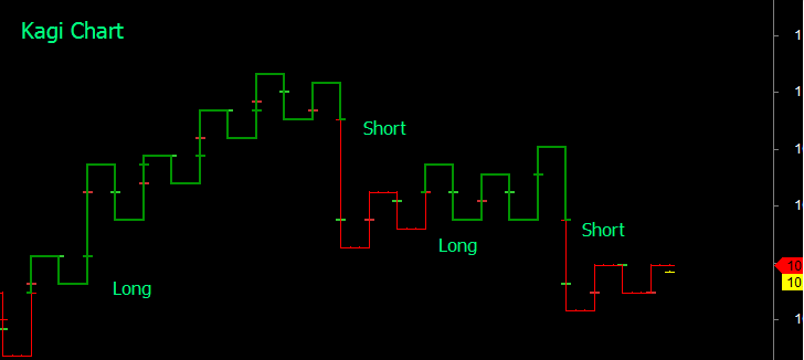
Kagi charts are a relaxed version of point and figure charts. Remember in PnF, we are using discrete box sizes. 1 unit, 2 units and so on. Remove the restriction, and draw an uptrend line as a vertical line up and reverse it to a vertical line down, when the price crosses a defined reversal threshold in the opposite direction after adding a fixed space between the two vertical lines. So if price in the PnF example above is $10 and in an uptrend we have a vertical line moving up. If price increments by $0.5, the price moves up by the same amount. If have kept the reversal at $2, nothing happens until price reverses by at least that amount. When that does occur, we draw a new vertical line parallel to the uptrend vertical line connecting the tops of the two lines with a fixed defined space between them (for each reversal). When directions reverse, the horizontal lines that are used as connectors, form peaks and troughs. Now when a vertical line crosses a peak level from below, the trend will change to up. Likewise when a vertical line crosses a previous trough from up to down, the trend will be down. A typical notation is to use thick lines for uptrends and thin lines for downtrends. Also the fixed reversal of price can be changed from fixed units to percentage of the last price to avoid the impact of change of scale in uptrends and down trends.
Notice how you can get PnF, Renko and Kagi to display the same data in a similar manner.
If the PnF Box is $2, reversal is 3 boxes, this is similar to
a Reno chart with brick size as $2 and reversal as 3 bricks.
You can also view the same data in Kagi charts, by introducing a box or brick concept for drawing the line as above and a reversal as indicated. When this is done the 3 charts will show the big picture in different visual presentations, with some very interesting and alternative interpretations. Explore the PnF charts sections in Technical Analysis here for more insights.
See the example of a Kagi chart below :
See below the example of Kagi chart.
And here is the authors version of a Point and Figure chart drawn with Kagi style representation. Nothing wrong with it, corresponds to the Point and Figure construction exactly with a more visually pleasing view. This TradeWithMe exclusive and copyright.